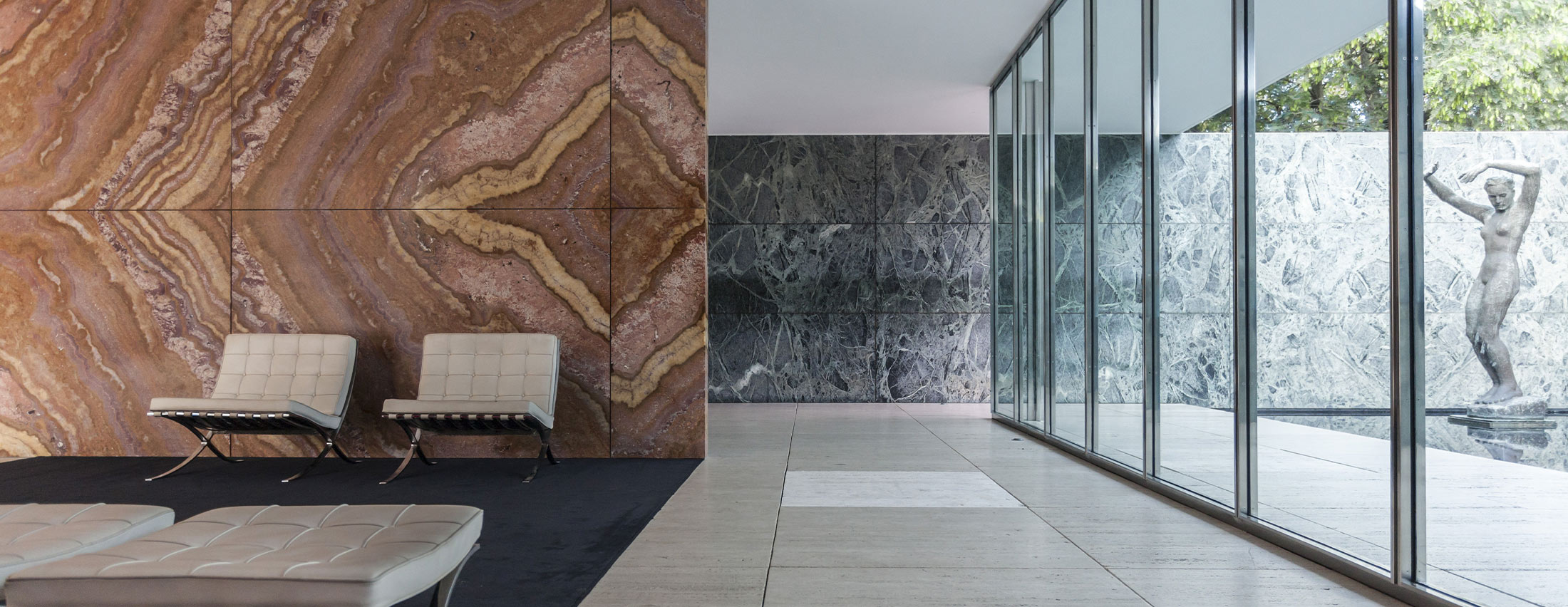
In recent years we’ve seen a return to the ‘less is more’ mentality and a reconnection to minimalism. Perhaps, this longing for simplicity demonstrates the necessity of removing ourselves from the complex, high-tech world we are in, and finding ways to immerse ourselves in what is essential.
Origin
The phrase “less is more” is often associated with German-American architect and designer, Ludwig Mies Van Der Rohe. Known for his design of the skyscraper, Mies believed that elegance was not derived from abundance. While Mies’ buildings were unornamented, they were not plain. He achieved visual richness by placing emphasis on pure essentiality and functional perfection casting aside any elements that do not contribute to the beauty or function of an object or space.
The ability to simplify means to eliminate the unnecessary so that the necessary may speak.
– Hans Hoffman
In American visual art, the movement of ‘less is more’ is still relatively new, having only come into its own in the late 1960s and early 1970s, known as minimalism. It borrows heavily from European and Japanese influence, and can be seen across various industries, from web design, interior spaces to furniture design.
Simplicity denotes clarity of concept and ideas. When we strip something down to the core of it’s foundation we can then bring forth the most important elements that need to be communicated.
Our Work
At Alfa Charlie, the principle of ‘less is more’ can be seen in most of our work. We begin each project with a brand strategy session to understand the essential components of a brand. We then utilize a clean and fresh approach to design logos, brands and websites that eliminate clutter and distractions. Every design is built with intent to communicate what is essential.
We focus heavily on creating white space that give designs fresh air to breath. We create logos that are simple but complex in meaning, messages that are clear but full of intent and user experiences that are friendly yet easy to understand.
As we think about building brands to stand out in a consumer-driven market, we realize the power of ‘less is more’ and our desire for it. A simple color palette, a blank space, a clear message.
