Challenge
Founder Michael Kluboch has made it his mission to connect kids to the ocean and provide educational opportunities that teach the next generation about their environmental impact. But when an organization’s mission runs through the hearts of everyone on the team, putting passion into words and visuals is not easy.
Approach
To understand the who, what, why, and how of Kids Ocean Day, we needed to get inside the headspace and heart of the team. From there, we would identify what was holding the brand back and where the opportunities were to move forward — the result: a renewed sense of empowerment in how they look and sound.
Messaging
Communicating what Kids Ocean Day does was one of the main pain points of the organization. By walking through our Brand Navigation Workshop, we created space to take a step back and listen. We uncovered the different views of the brand to realign the messaging and discovered an untapped audience. We reframed the core message of Kids Ocean Day, creating a cohesive description of who they were and what they do. While taking on the voice of Michael, the messaging remains uplifting and encouraging but is precise and clear-cut, appealing to both a younger and mature audience.
“There is something about the two of you … there is a safe space and gentleness to engage with people. You take the time, and you really make us feel like we have time, and you are listening and really want to shape this. There is something that rests with you two and your personalities.” – Founder, Michael Kluboch
Visual Identity
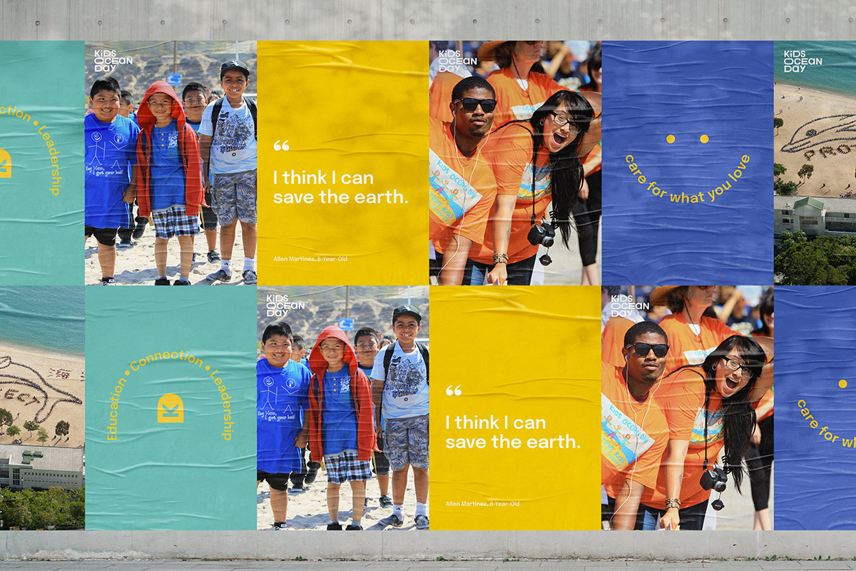
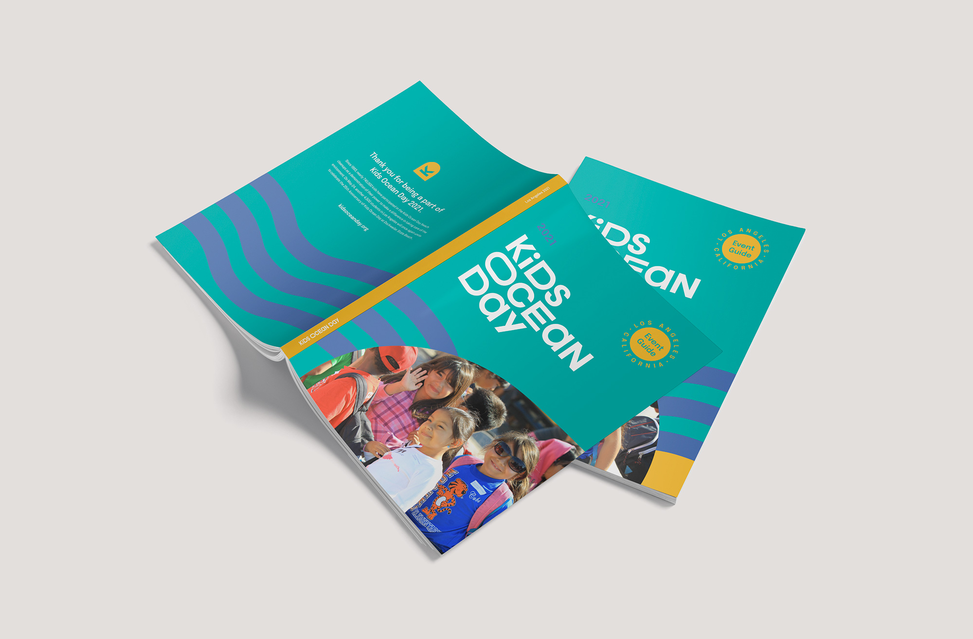
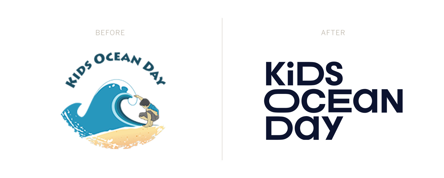
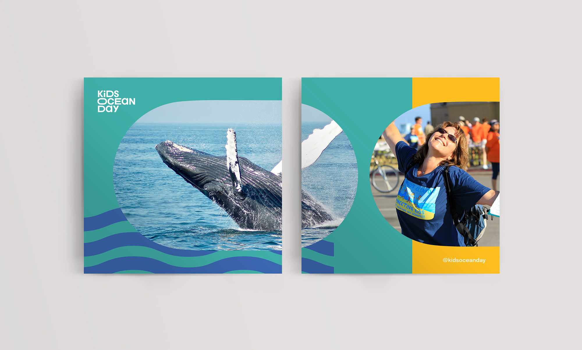
With an improved understanding of the organization’s broader audience, we renovated the Kids Ocean Day visual identity. We simplified the company’s logo to a wordmark using custom letterforms that compliment the casual and playful expression of the organization. Combined with lively typography, vibrant colors, and a versatile collection of shapes and patterns, the new visuals embody the organization’s spirit and provide concrete features to increase brand recognition. The elements stand strong and personify the feelings of empowerment that the brand stands for.
“The branding gives a sense of unity. A visual unity to your work. It’s putting a clean, clear image out there, and people respond to it.” – Founder, Michael Kluboch
See full project
Website
Rebuilding the Kids Ocean Day website became critical in bringing the new visual brand to life, especially during a pandemic. With events postponed and assemblies moving to a virtual classroom, the website became essential for communicating the organization’s vision and showcasing what Kids Ocean Day is all about.
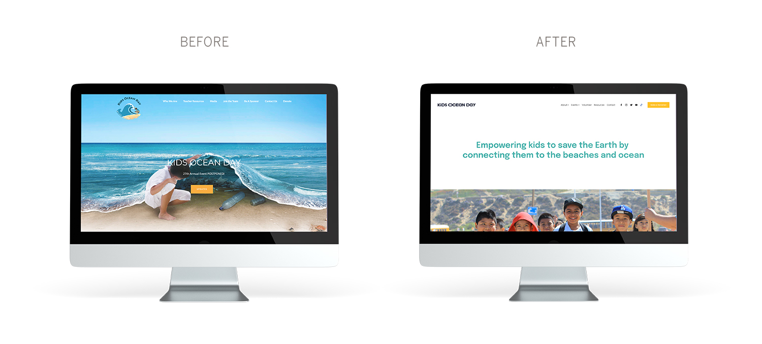
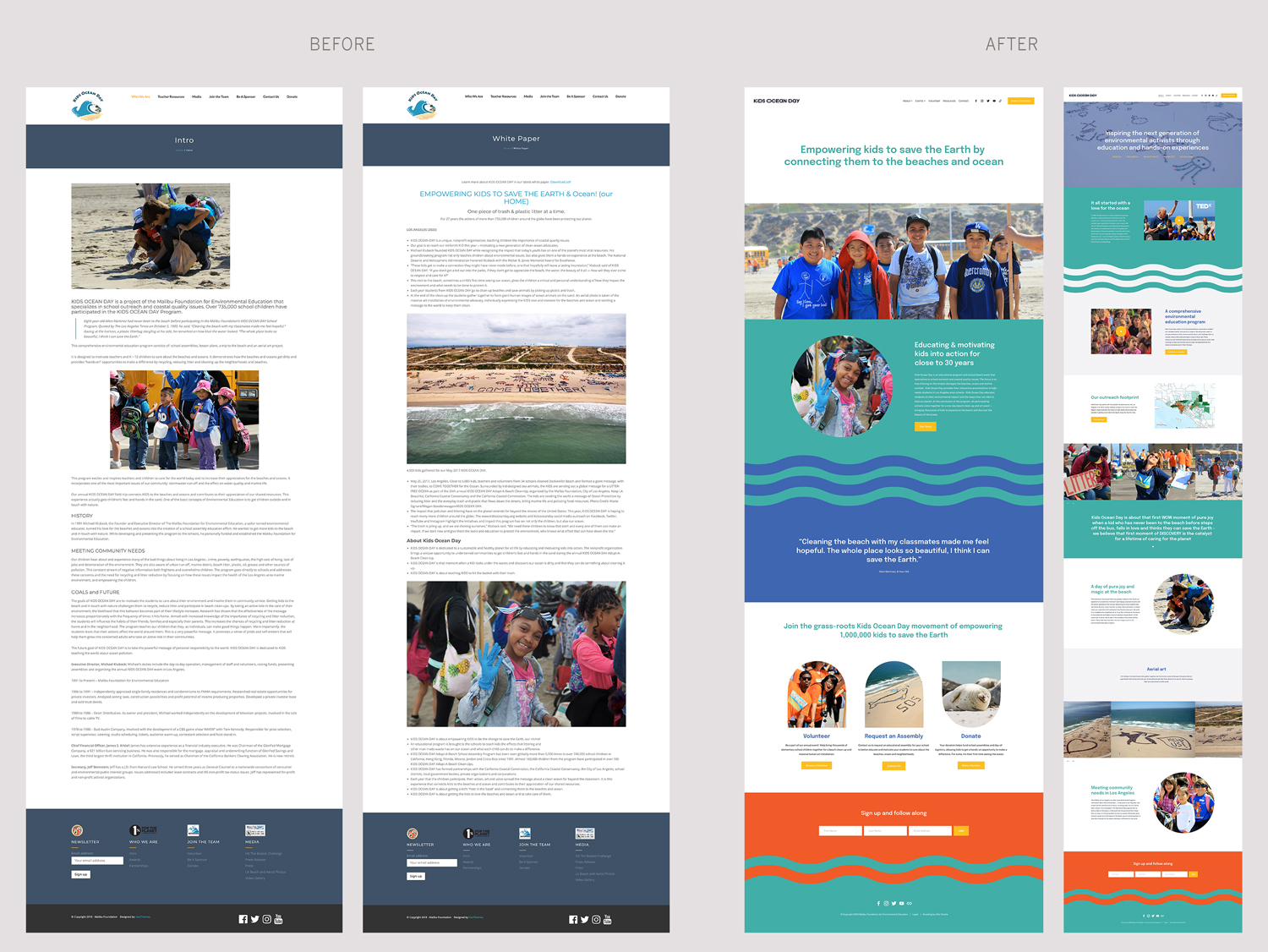
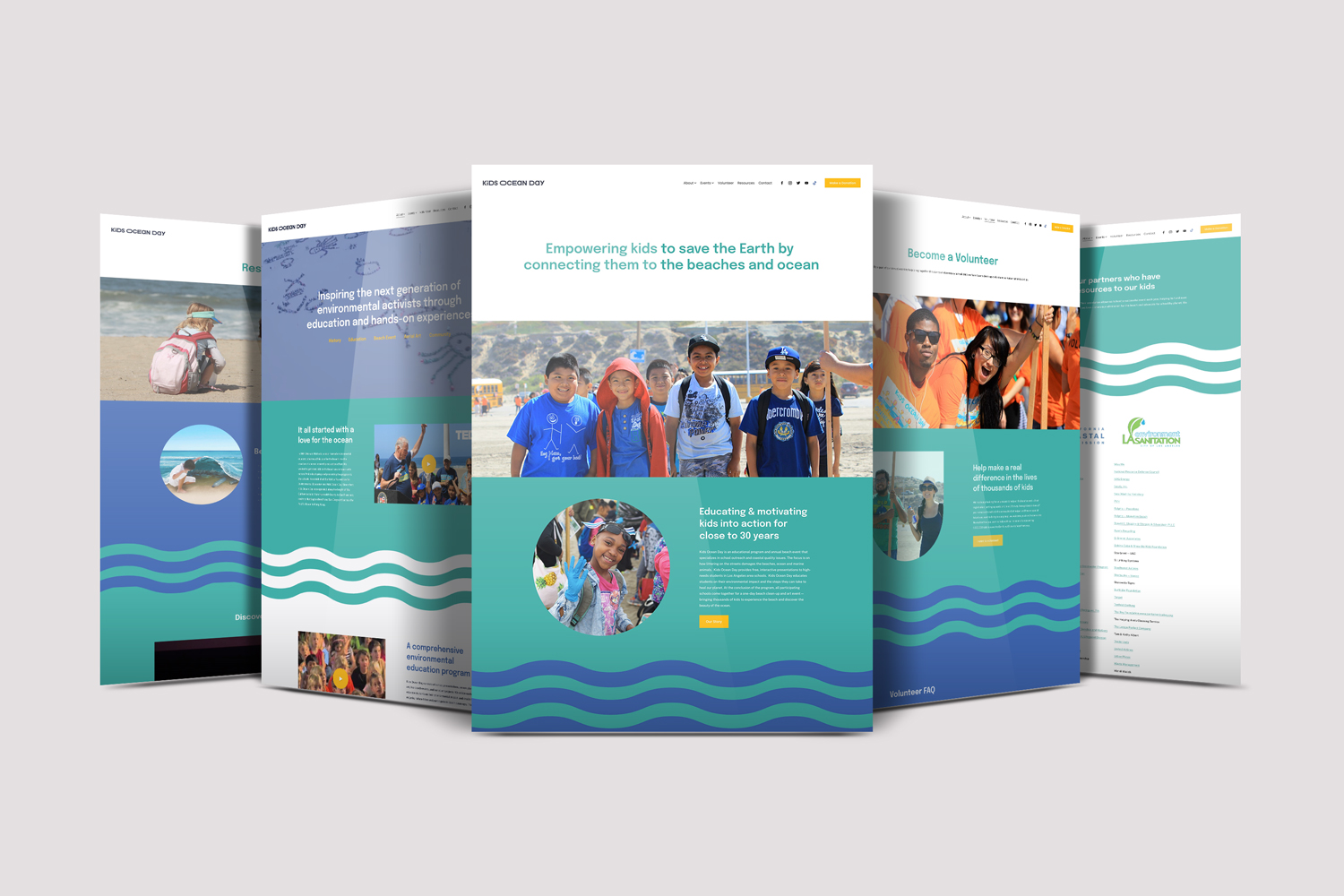
Our main focus when reorganizing the website’s structure was to create a user experience that was smooth and easy to navigate. Using the defined audience personas, we organized the content into easily digestible sections so that each user can quickly find what they are looking for. Mixed with vibrant visuals and imagery, the user is immersed in the organization’s spirit and the joy that Kids Ocean Day stands for.
“The professional upgrade that the website got and the youthful look of it … it’s a nice parallel to the youthful attraction of the work and the professionalism that goes behind the scenes of Kids Ocean Day. It gives a look that, I think, tells Kids Ocean Day in a lively, young, and professional way.” – Lisa Dobbins, Advisory Board member
