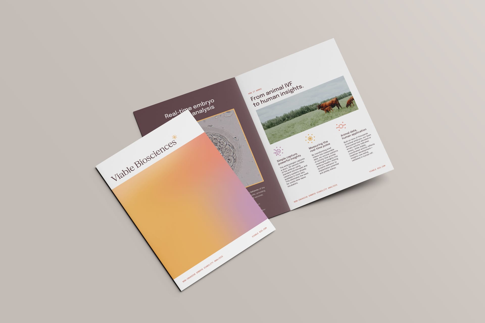


VIABLE BIOSCIENCES
Designing a precision-driven brand identity for non-invasive embryo viability technology
In IVF, selecting the most viable embryo is one of the most consequential decisions clinicians face. Traditional evaluation methods rely heavily on subjective visual assessment, often missing subtle but meaningful signals of embryo health. Founder Cara Wells set out to change that by using real-time video analysis and image subtraction technology to reveal objective patterns linked to successful outcomes. Through EmGenisys, she proved the technology on tens of thousands of bovine embryos across nearly every continent. Now she's bringing it to human IVF with Viable Biosciences.
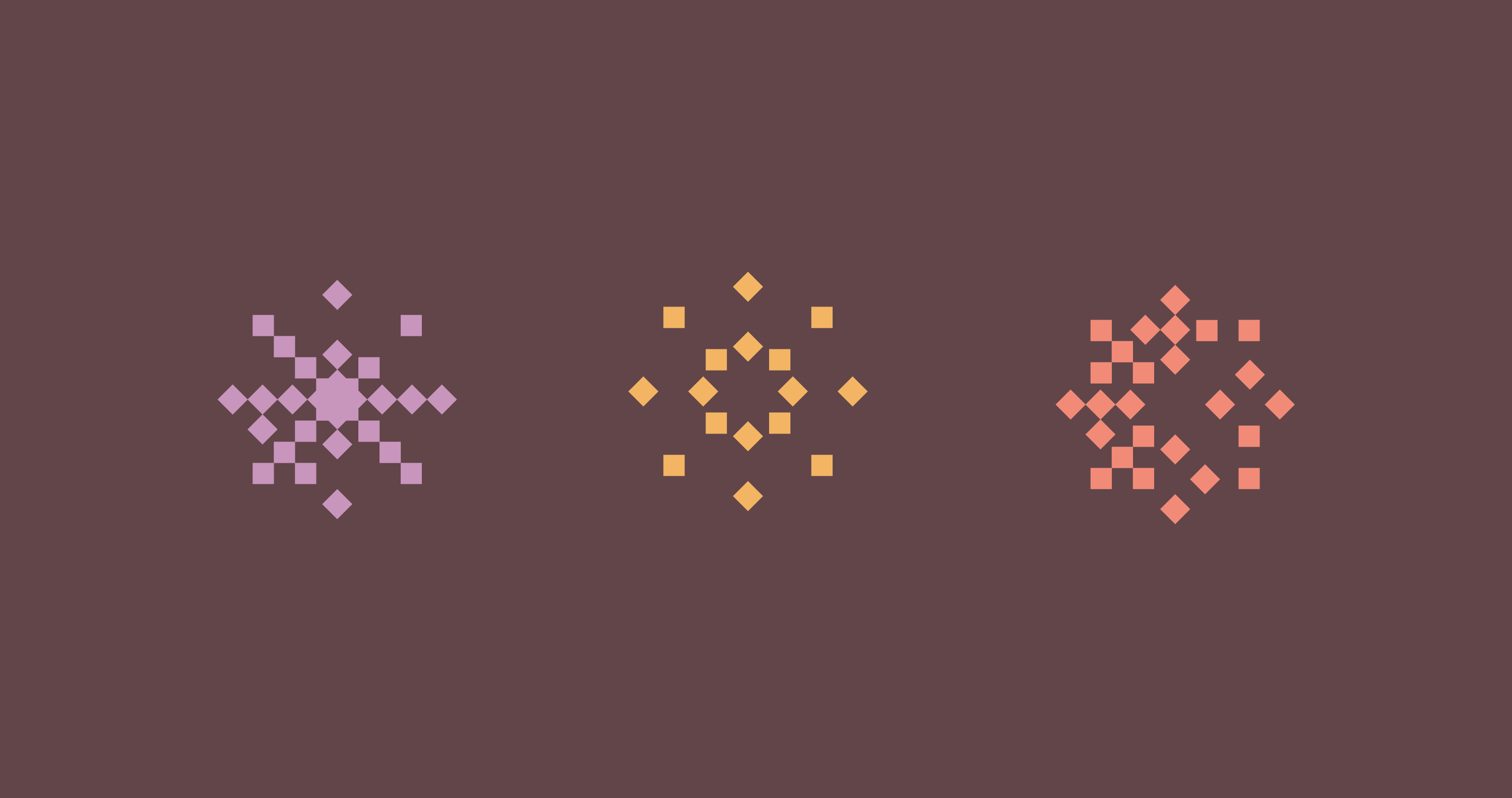
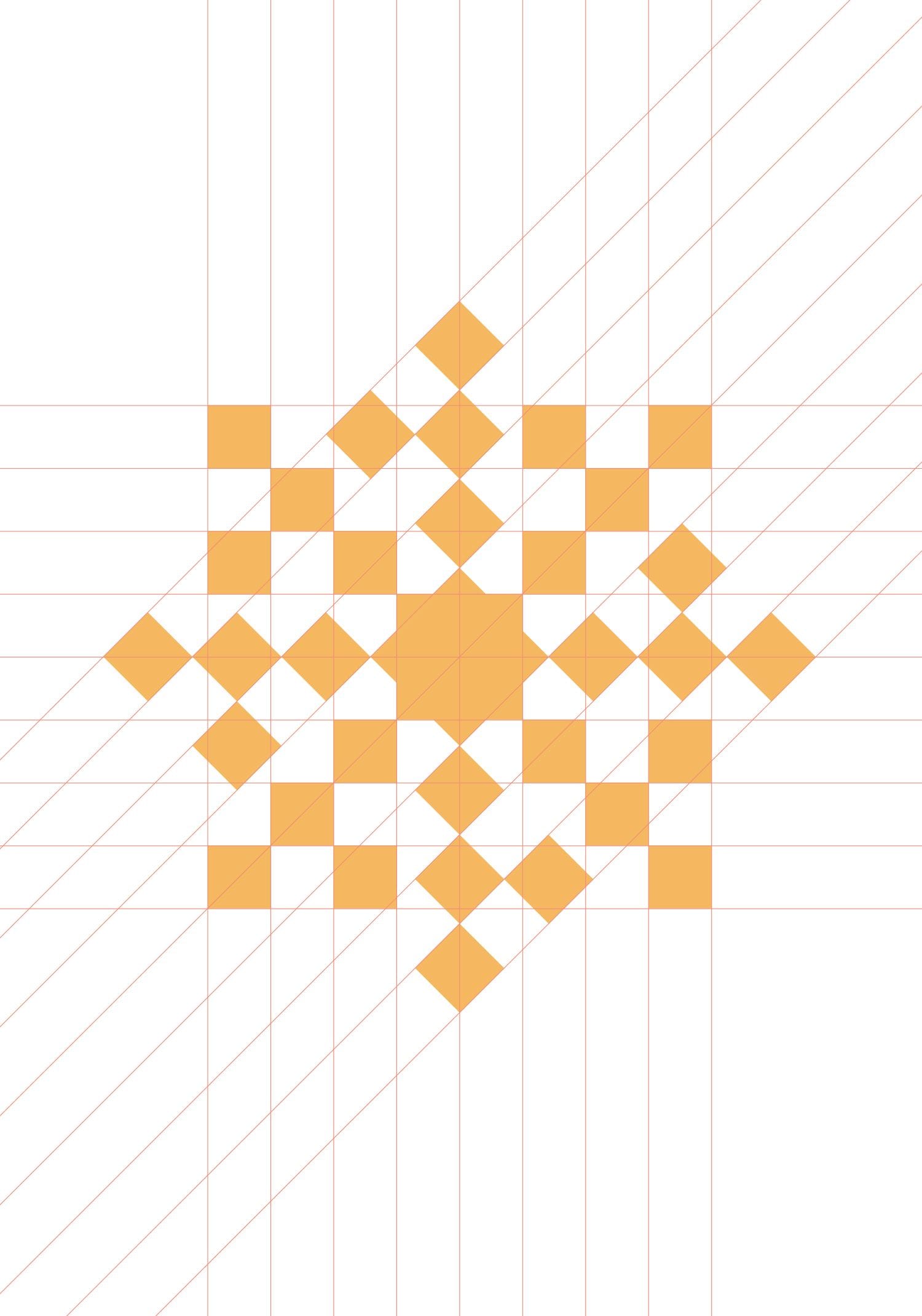
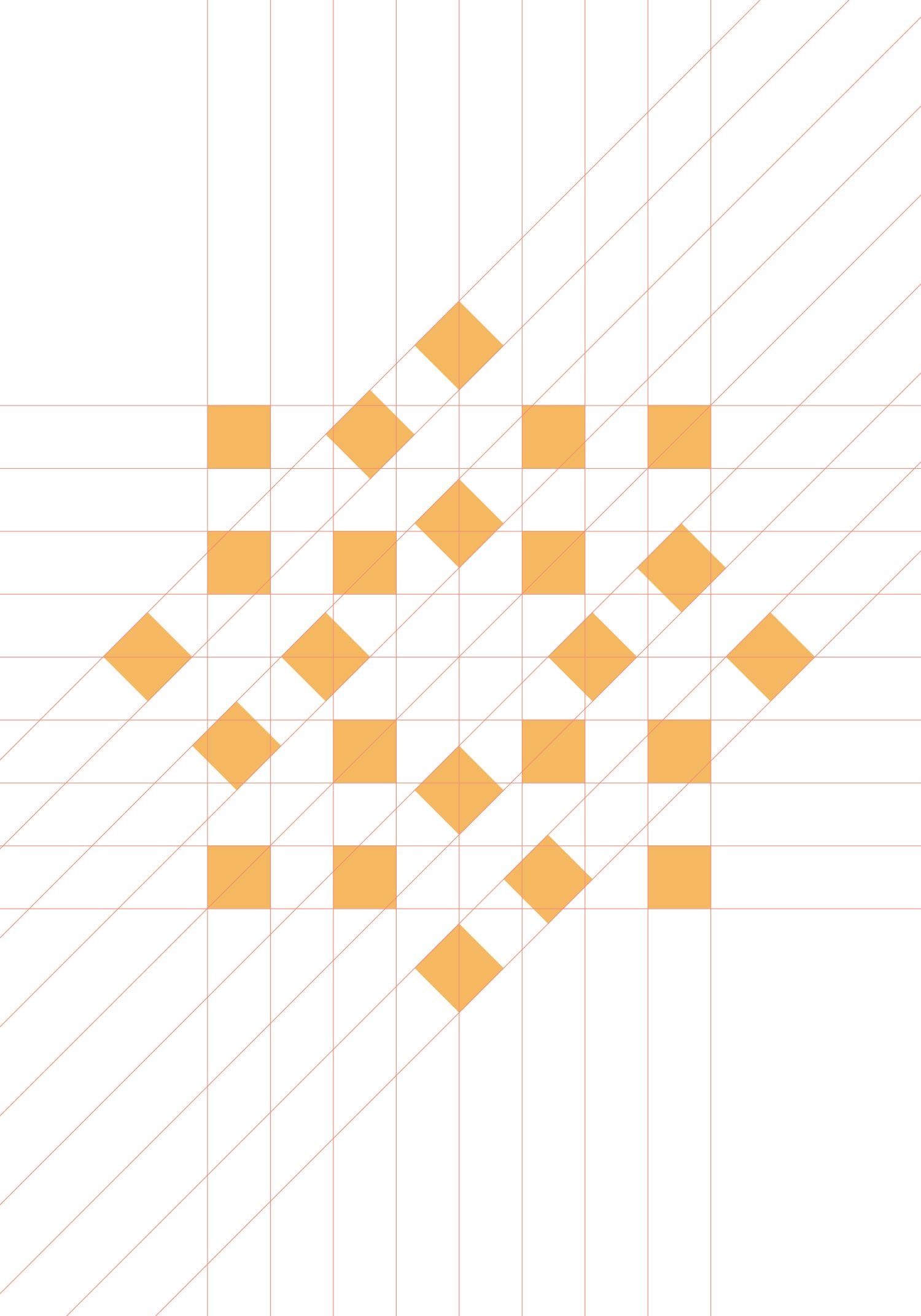
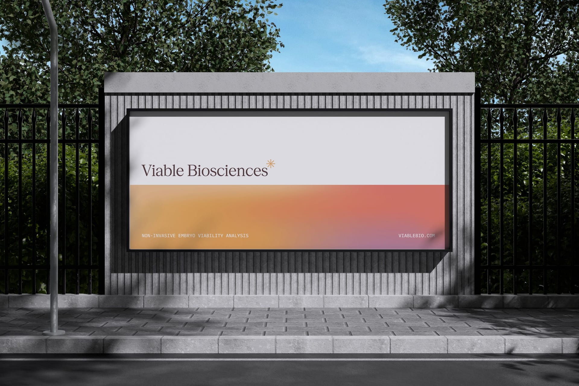
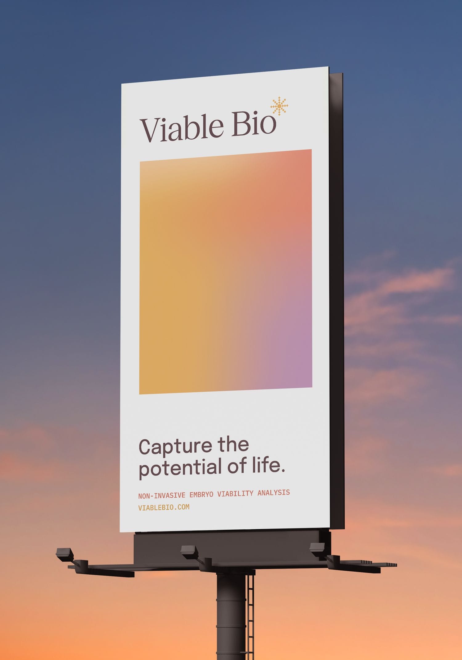
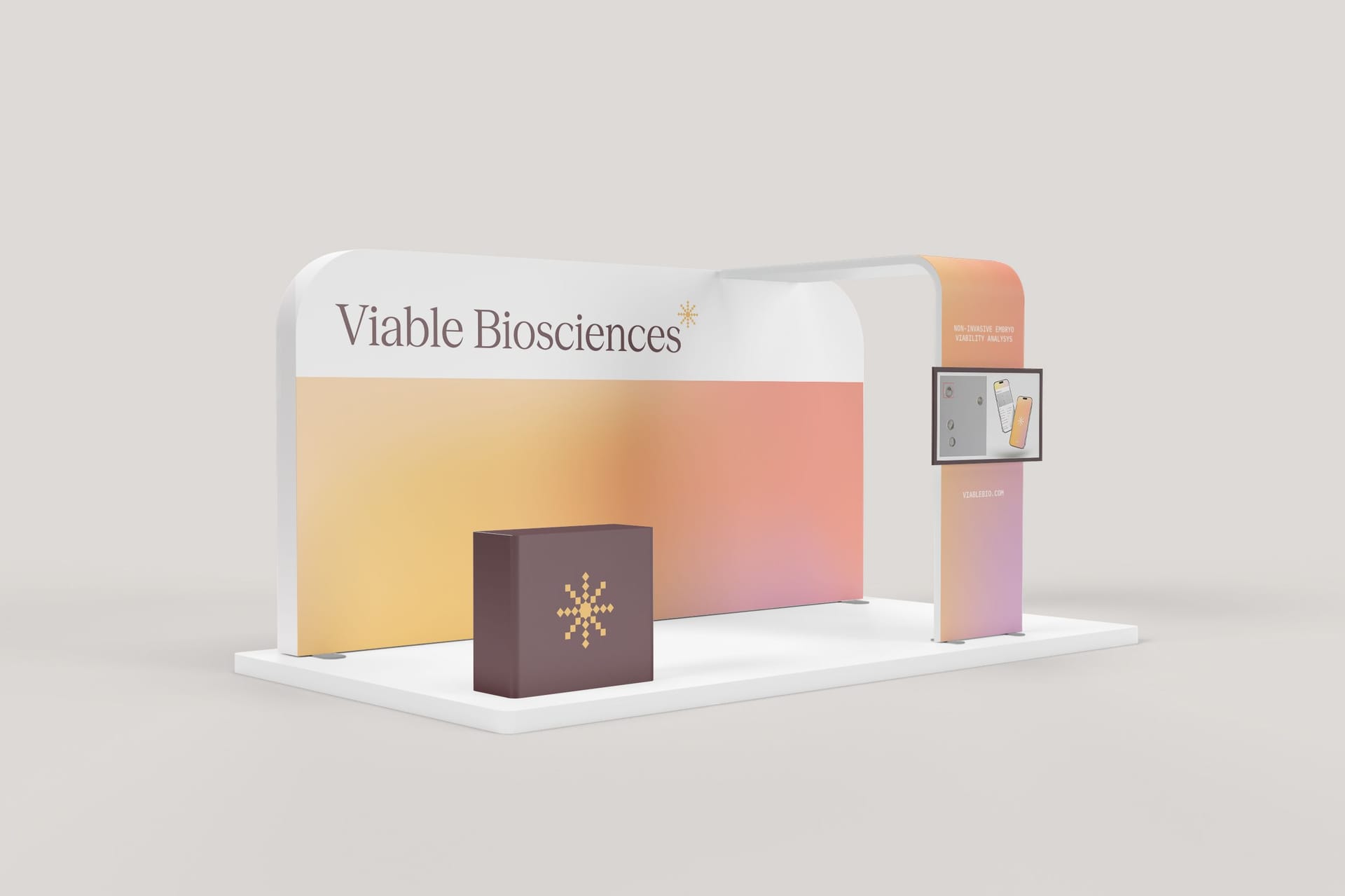
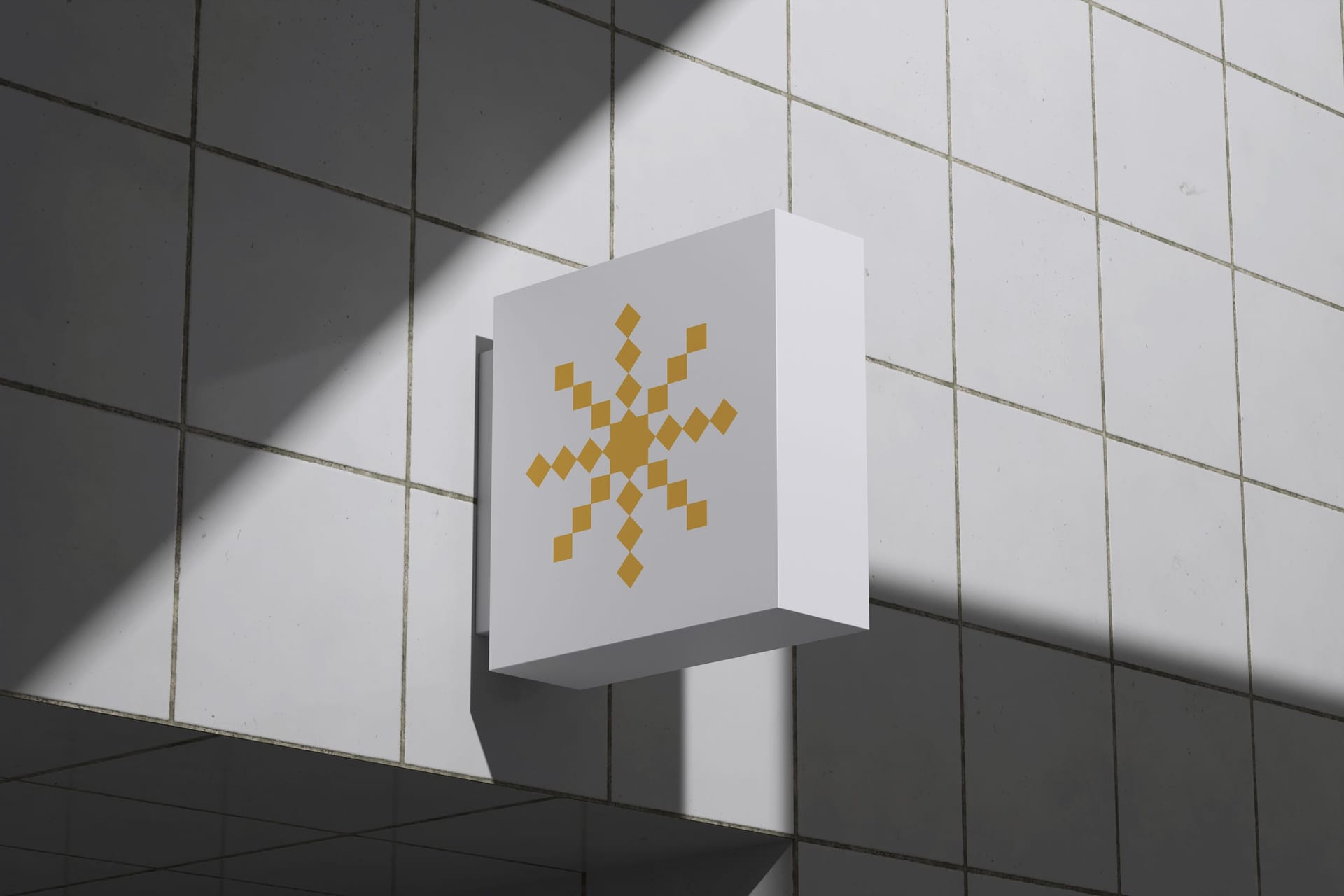
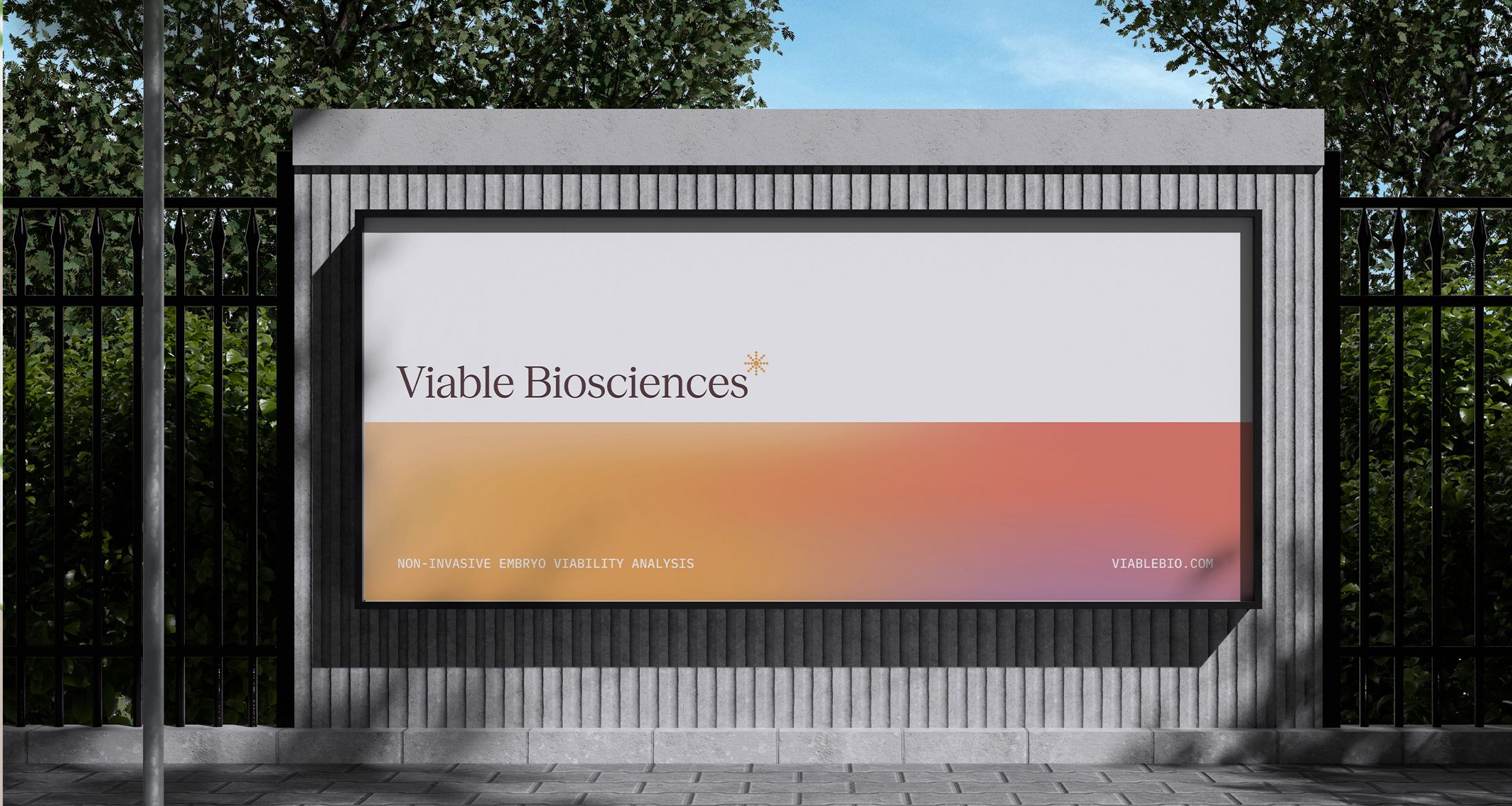
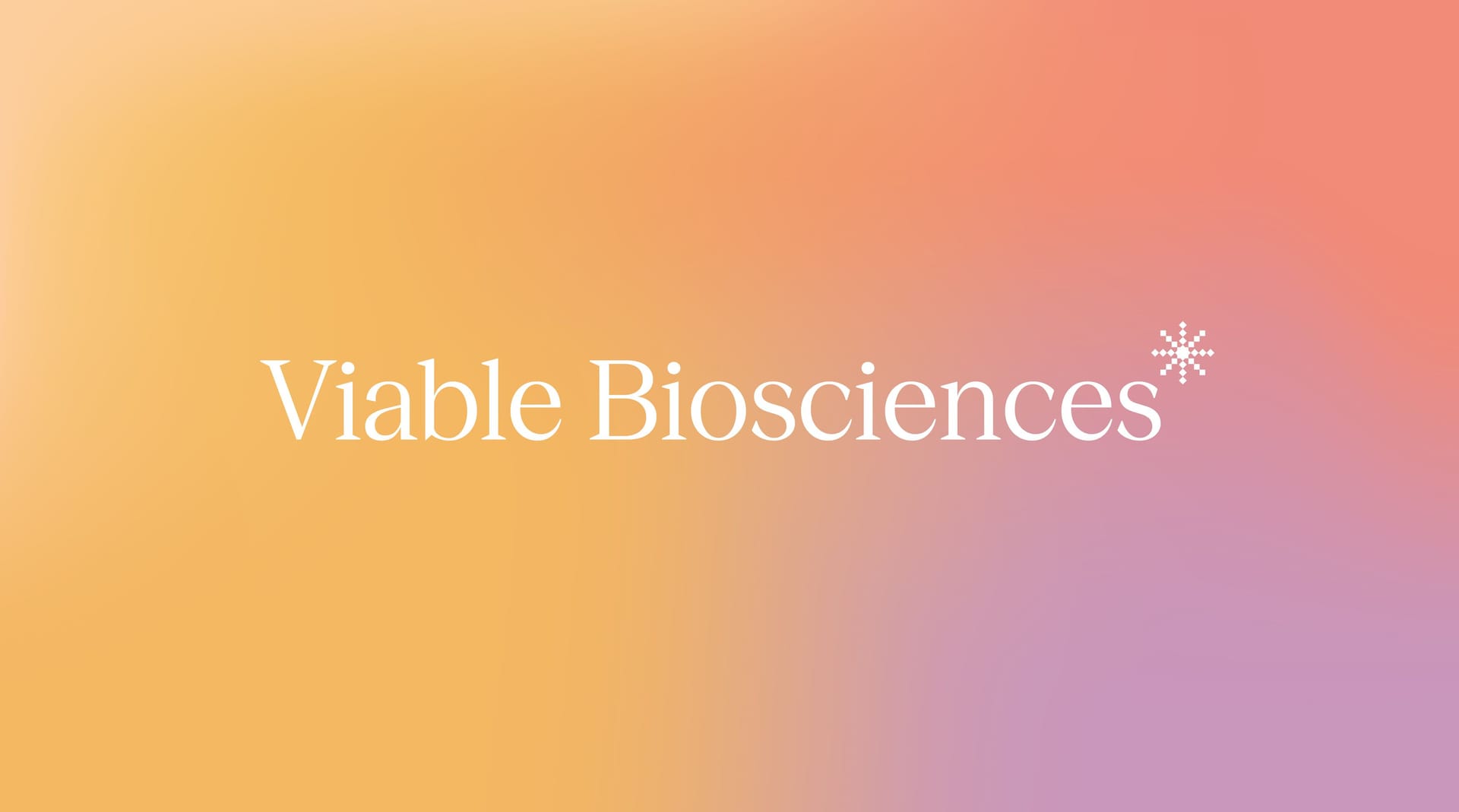
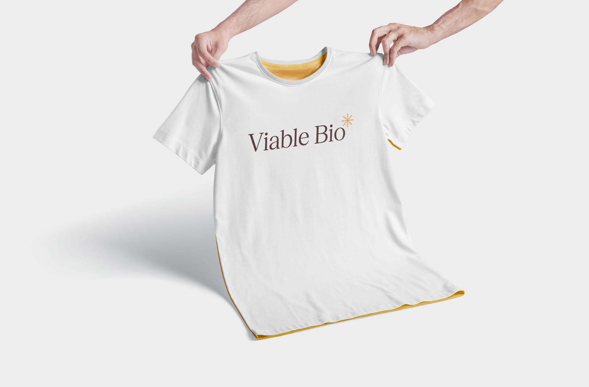
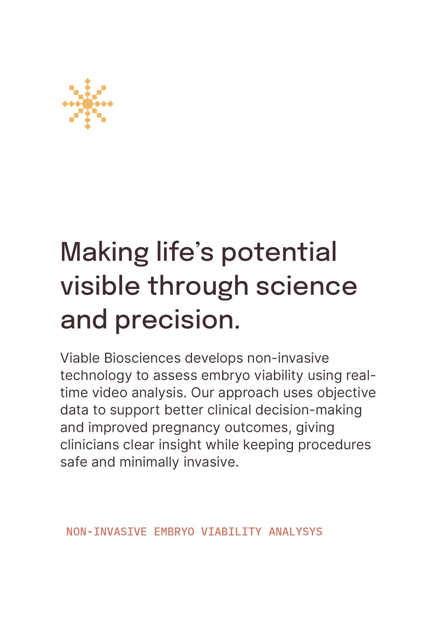
We identified life as the core axis of the Viable Biosciences story. Through the Viable Bio lens, life is order: structured and measurable. The logo is built on a pixel grid that references their image subtraction process directly, reducing complex embryo motion into discrete units so meaningful patterns can emerge. An asterisk form draws the eye inward and radiates outward, echoing the idea that all life originates from a single cell, while negative space reinforces the act of discovery through subtraction. Though not a literal circle, the eye completes the form, creating a subtle glow. Yellow anchors the palette as a signal of life and clarity, supported by coral and purple accents, with deep browns grounding the system. A modern serif wordmark adds sophistication and distance from typical tech aesthetics, positioning Viable Biosciences as a leader in data-driven reproductive science.
Working with Alfa Charlie on the Viable Biosciences logo design was an exceptional experience from start to finish. They truly over-delivered, bringing a level of thoughtfulness and intention to every detail. The “clean but not sterile” aesthetic is exactly what we were aiming for, but what impressed me most was their ability to reconnect me with my own vision—their presentation made me fall in love with the company all over again.
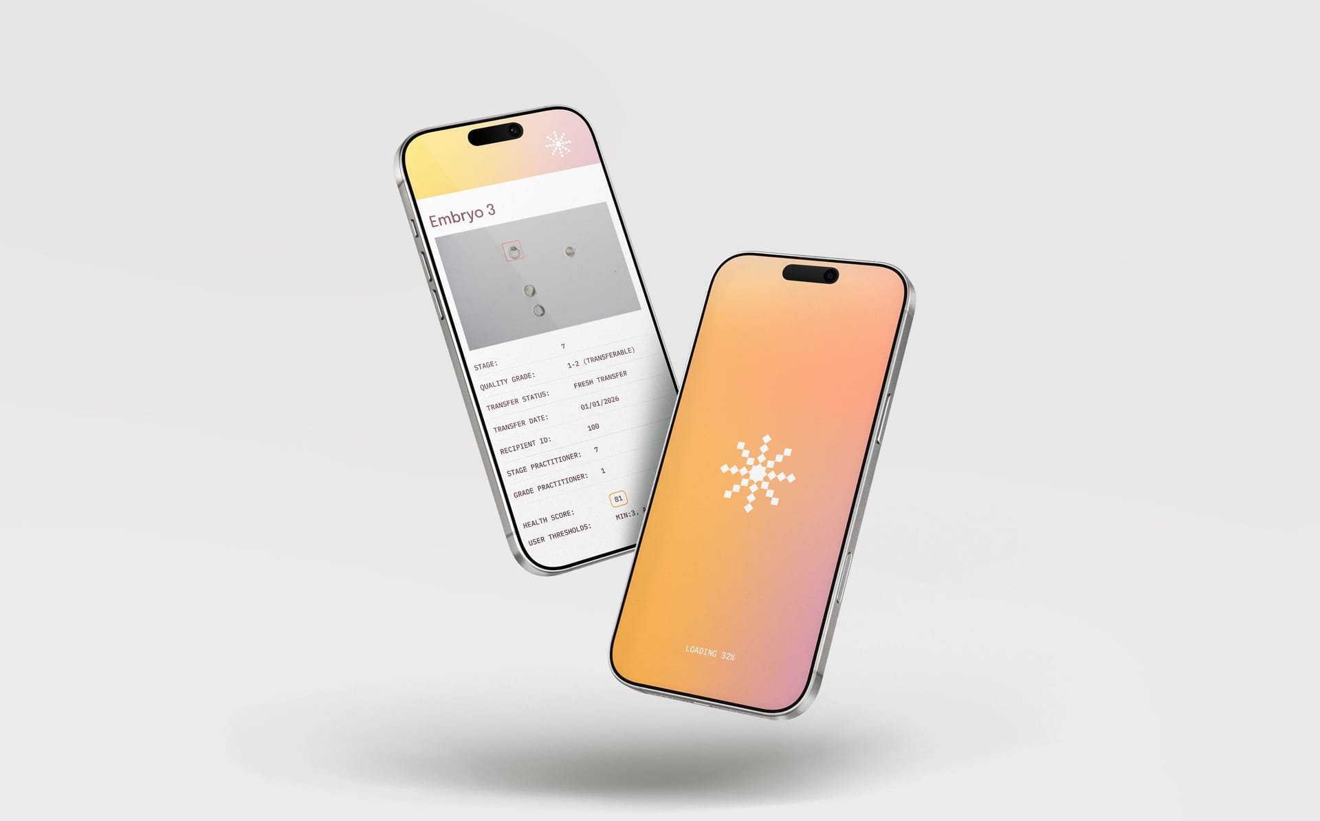
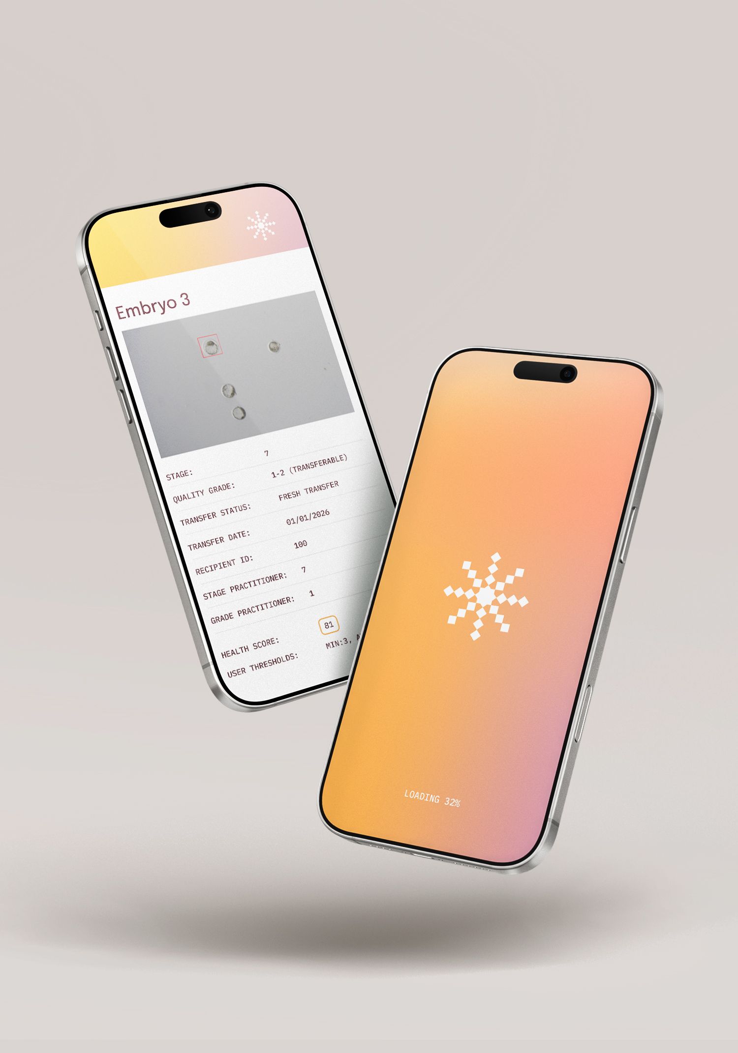
The brand's living icon system is built on a flexible pixel grid, allowing for variations where more or fewer units are activated. These shifts create expressive secondary icons and patterns while reinforcing the idea of emergence through data. The system naturally lends itself to motion, mirroring Viable Bio’s 30-frame, 30-second video analysis—where subtle changes over time reveal meaningful insight. This adaptability makes the mark both functional and dynamic across digital, product, and experiential touchpoints.