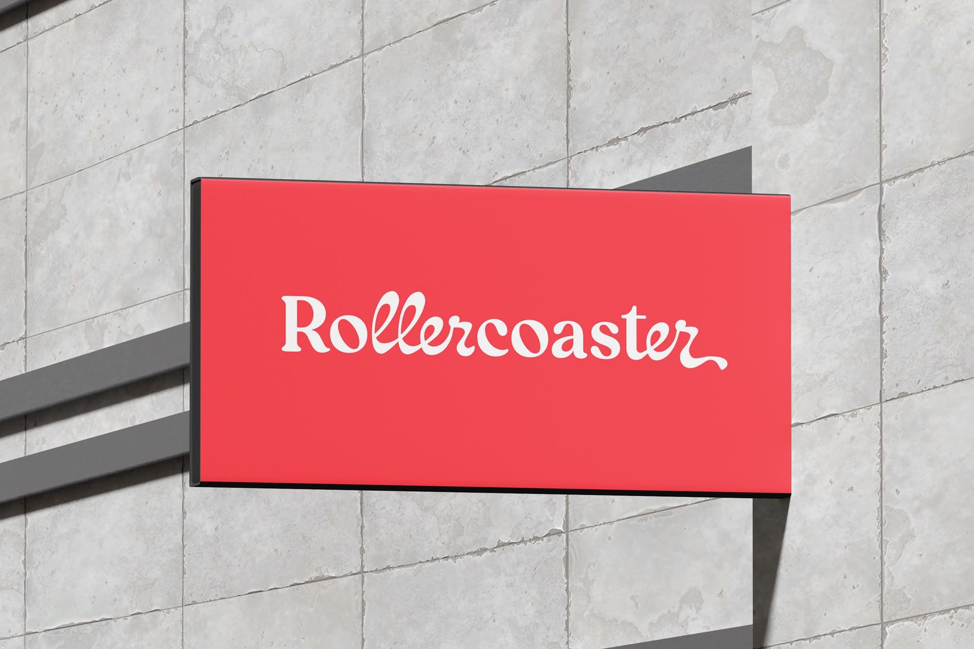


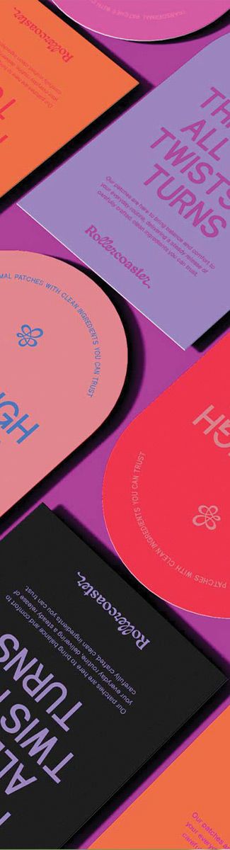
Rollercoaster Labs
Designing a bold identity that embraces the ride of womanhood, from menopause to cycle care.
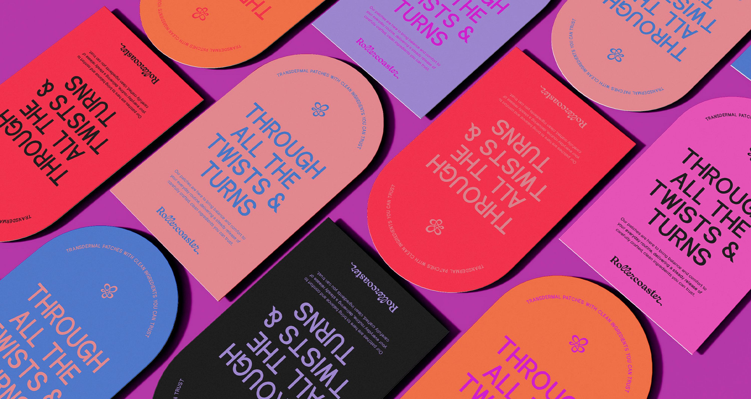
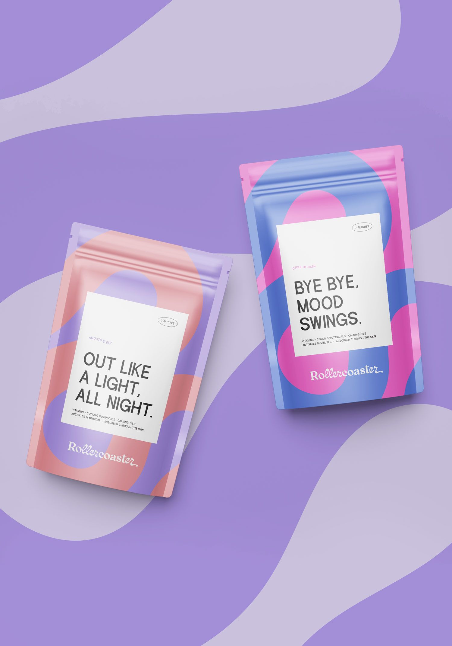
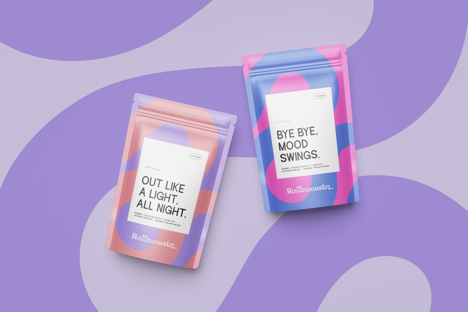
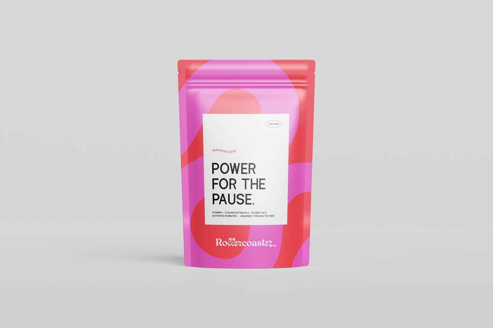
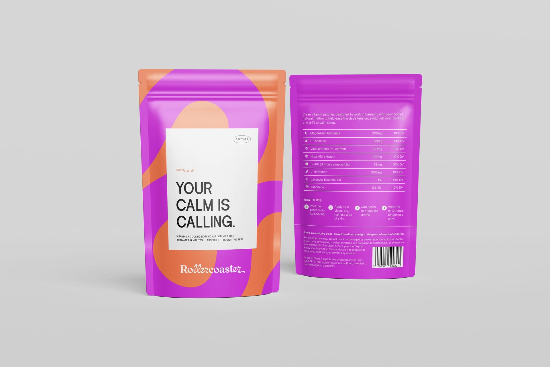
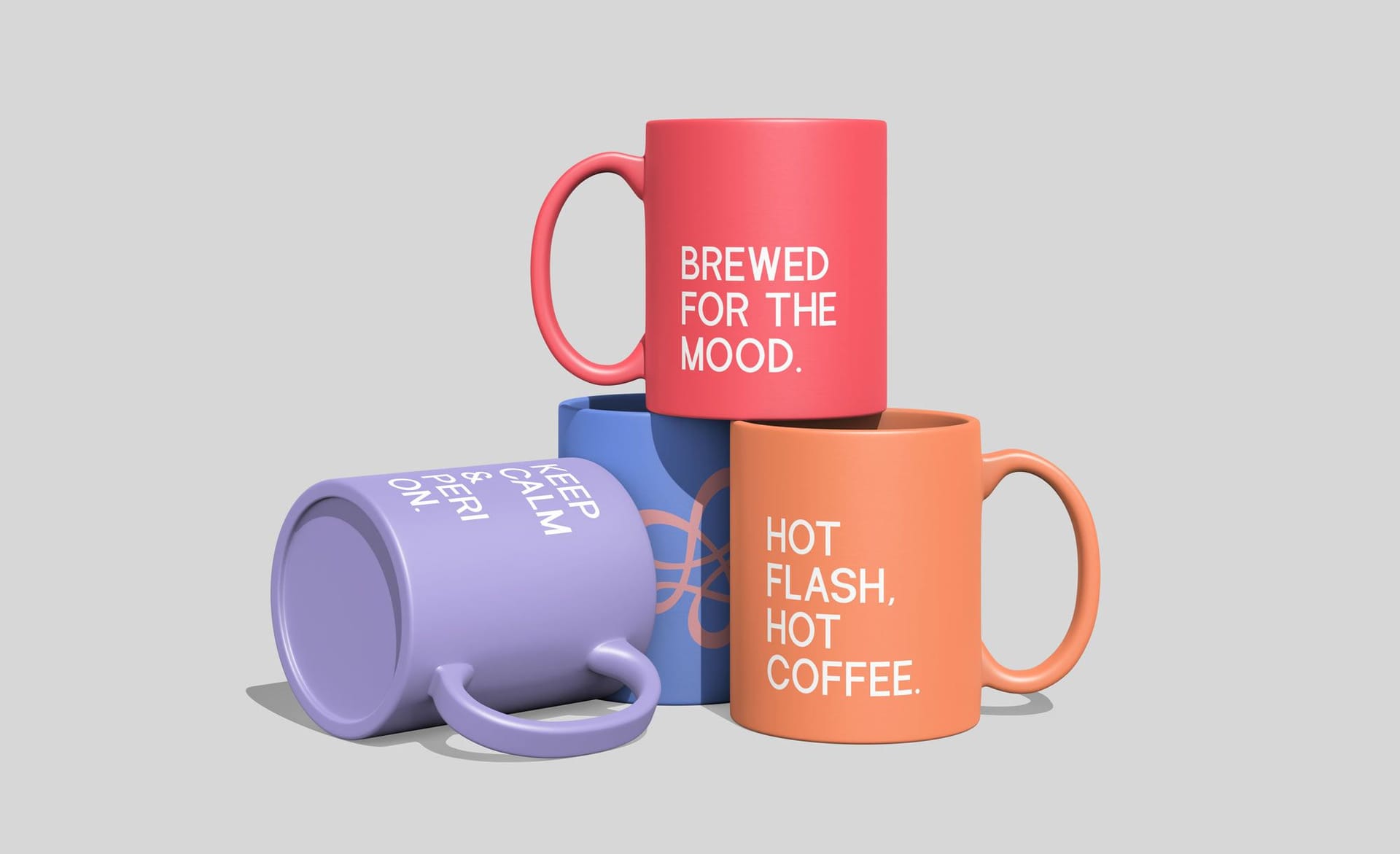
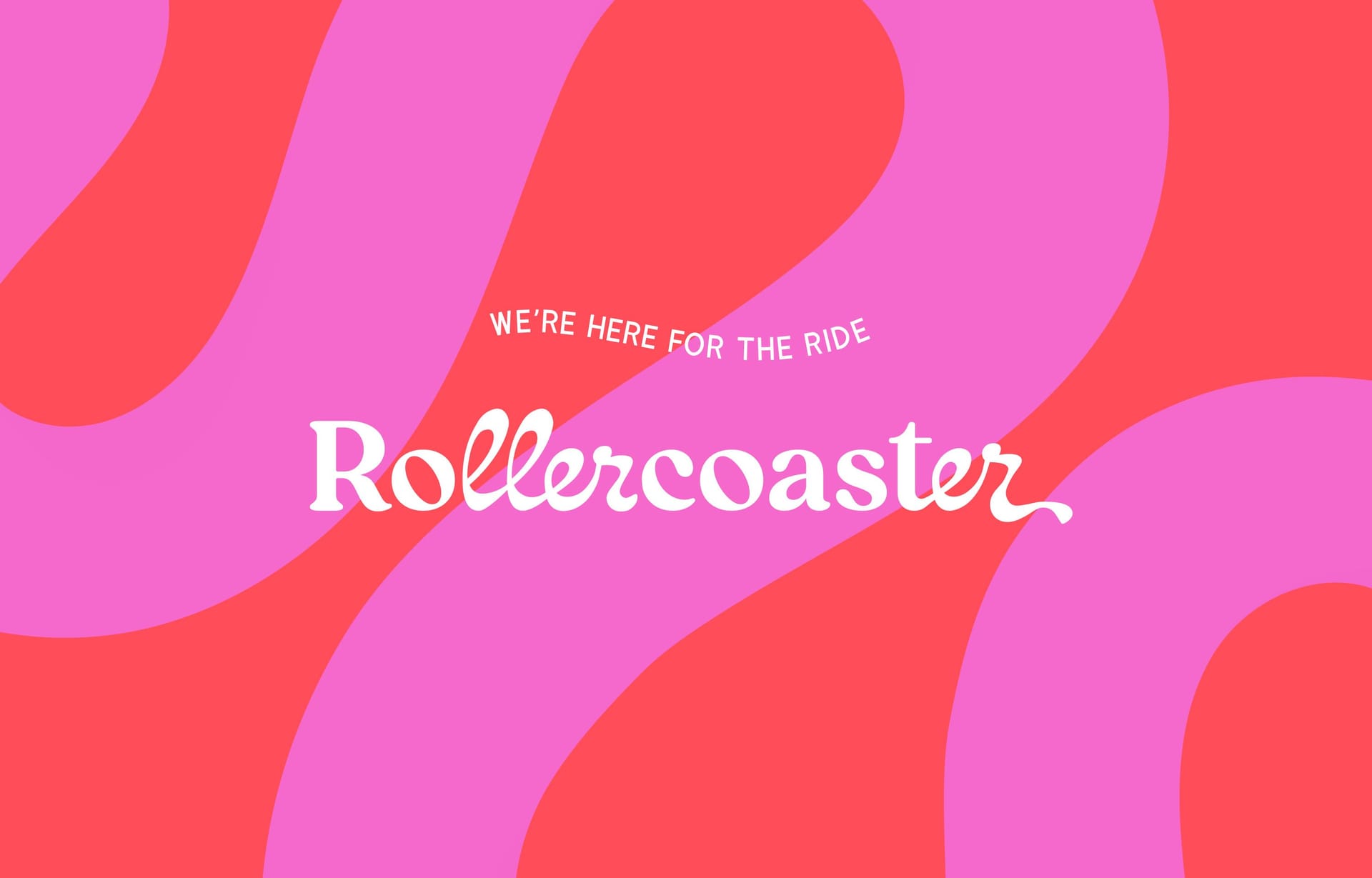
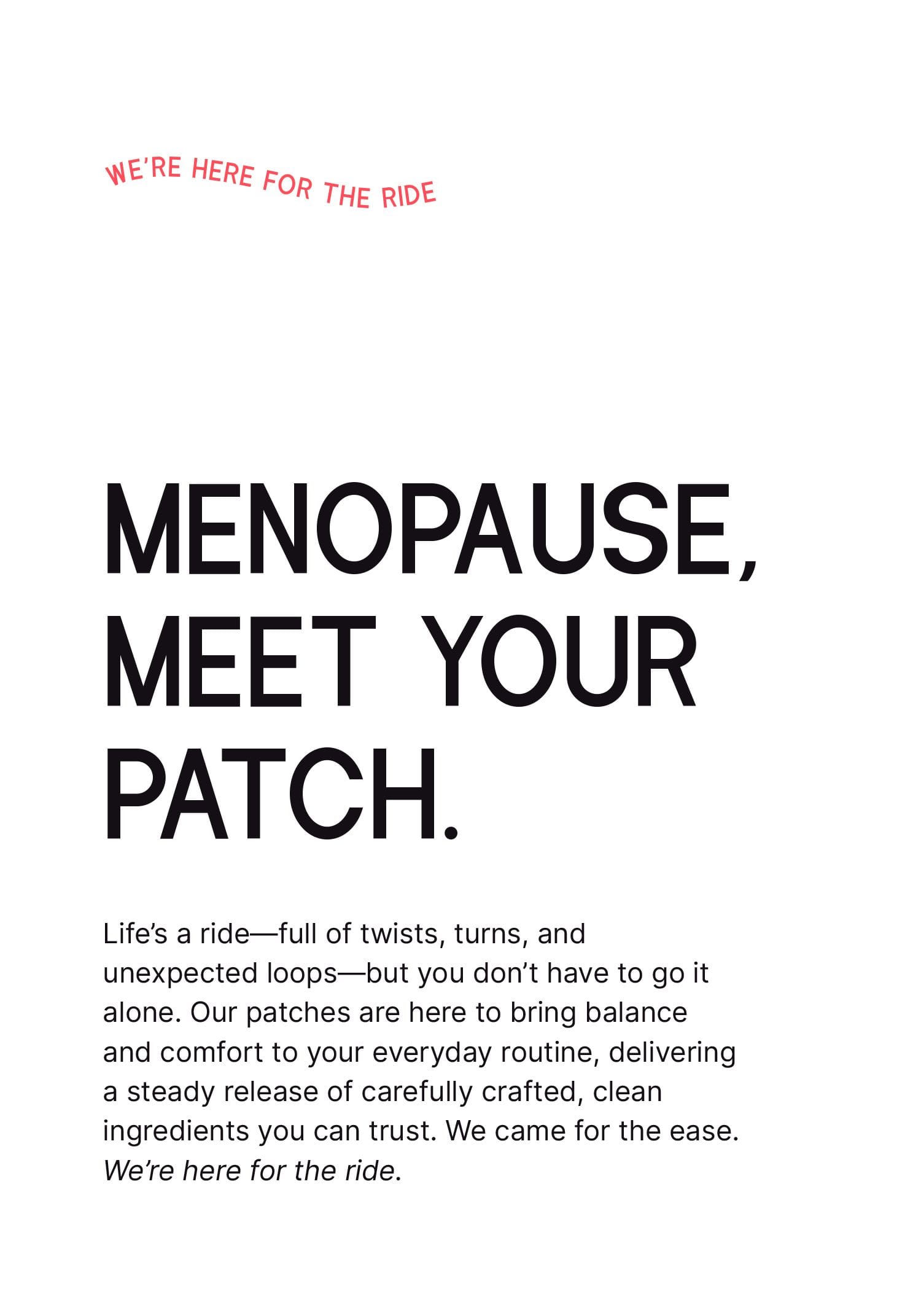
Menopause, sleep struggles, cycle chaos—women's health challenges don't come with sugar-coating, so why should the solutions? Rollercoaster Labs creates transdermal patches that deliver science-backed relief with refreshing honesty about the ups and downs of womanhood.
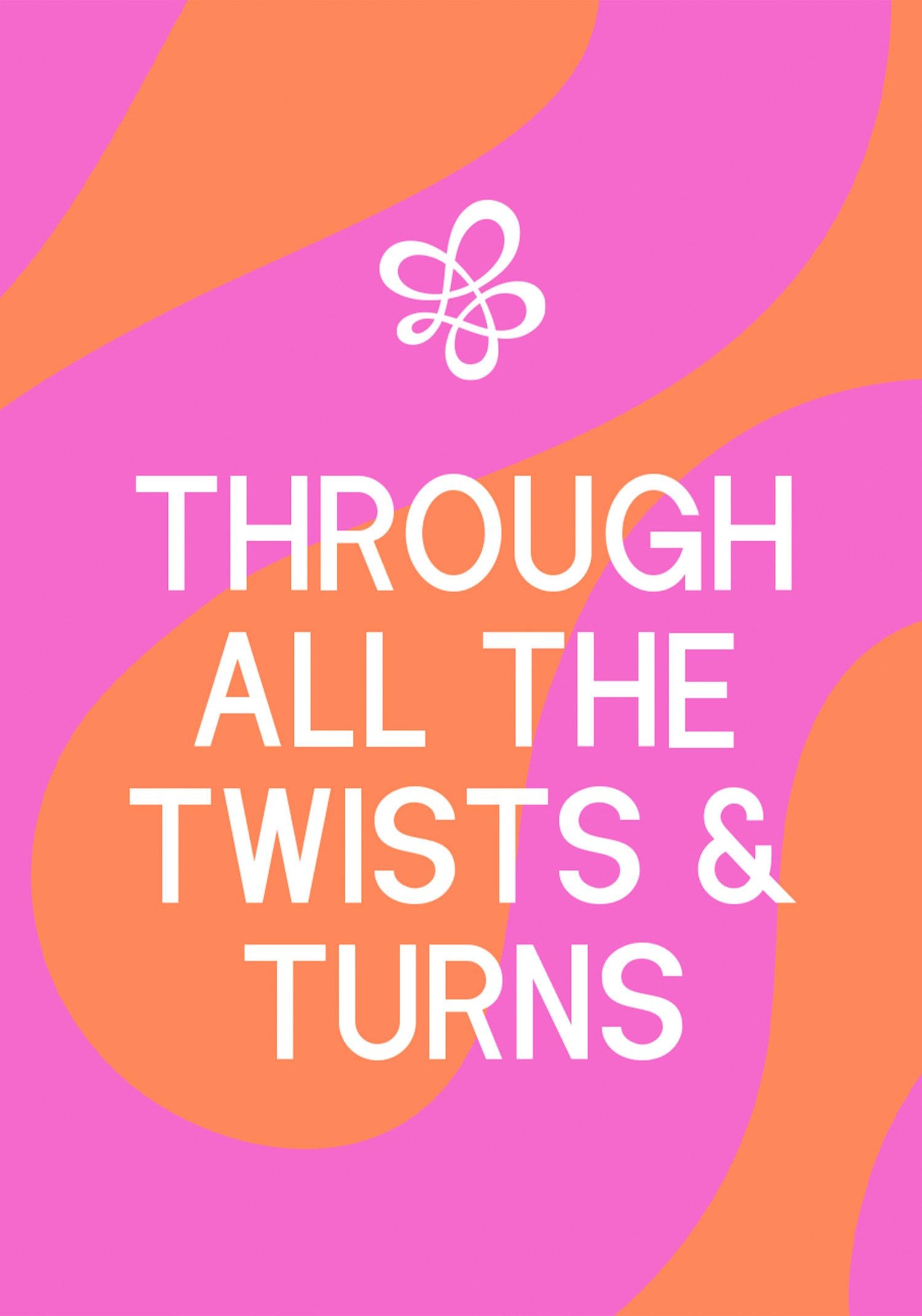
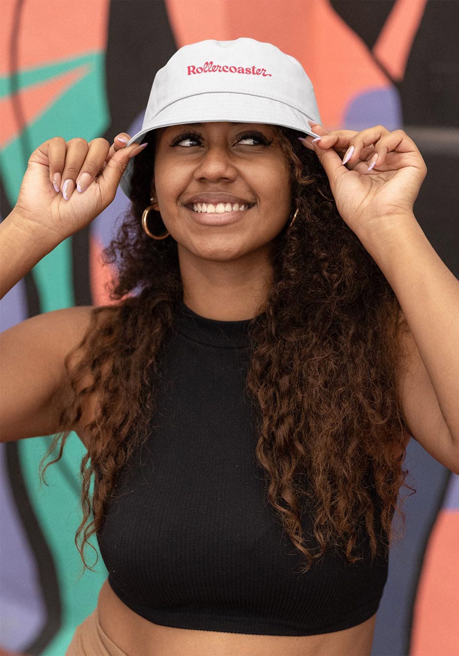
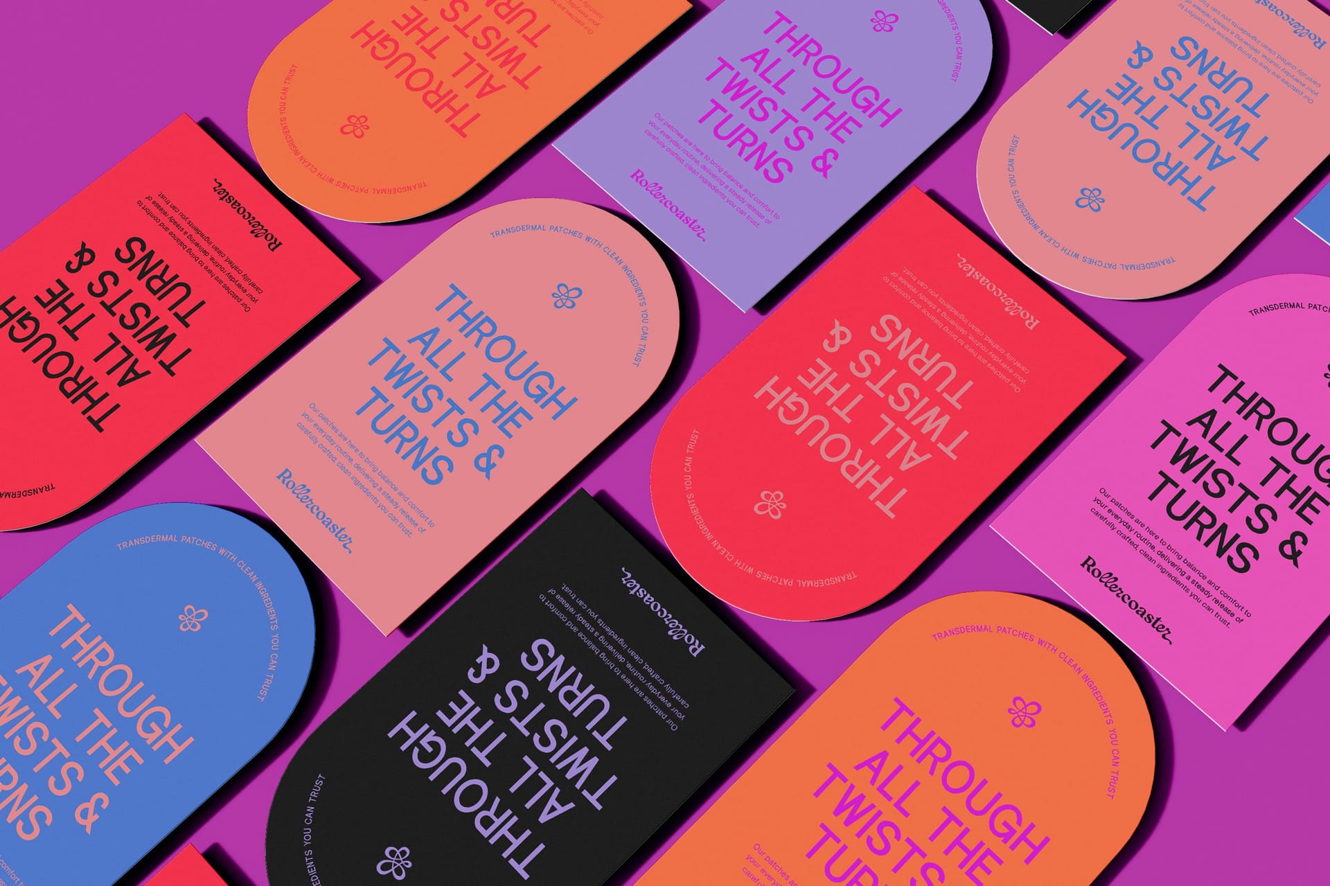
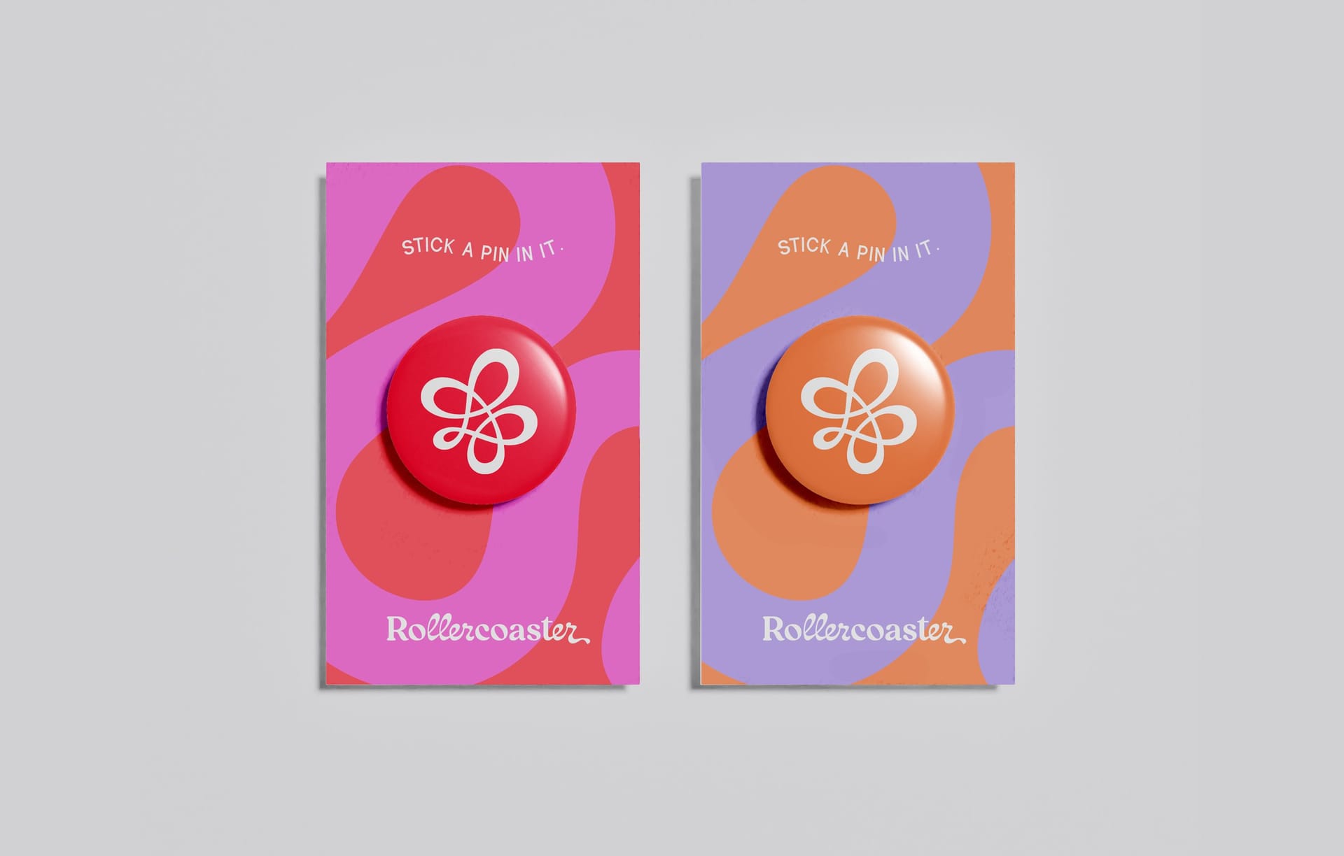
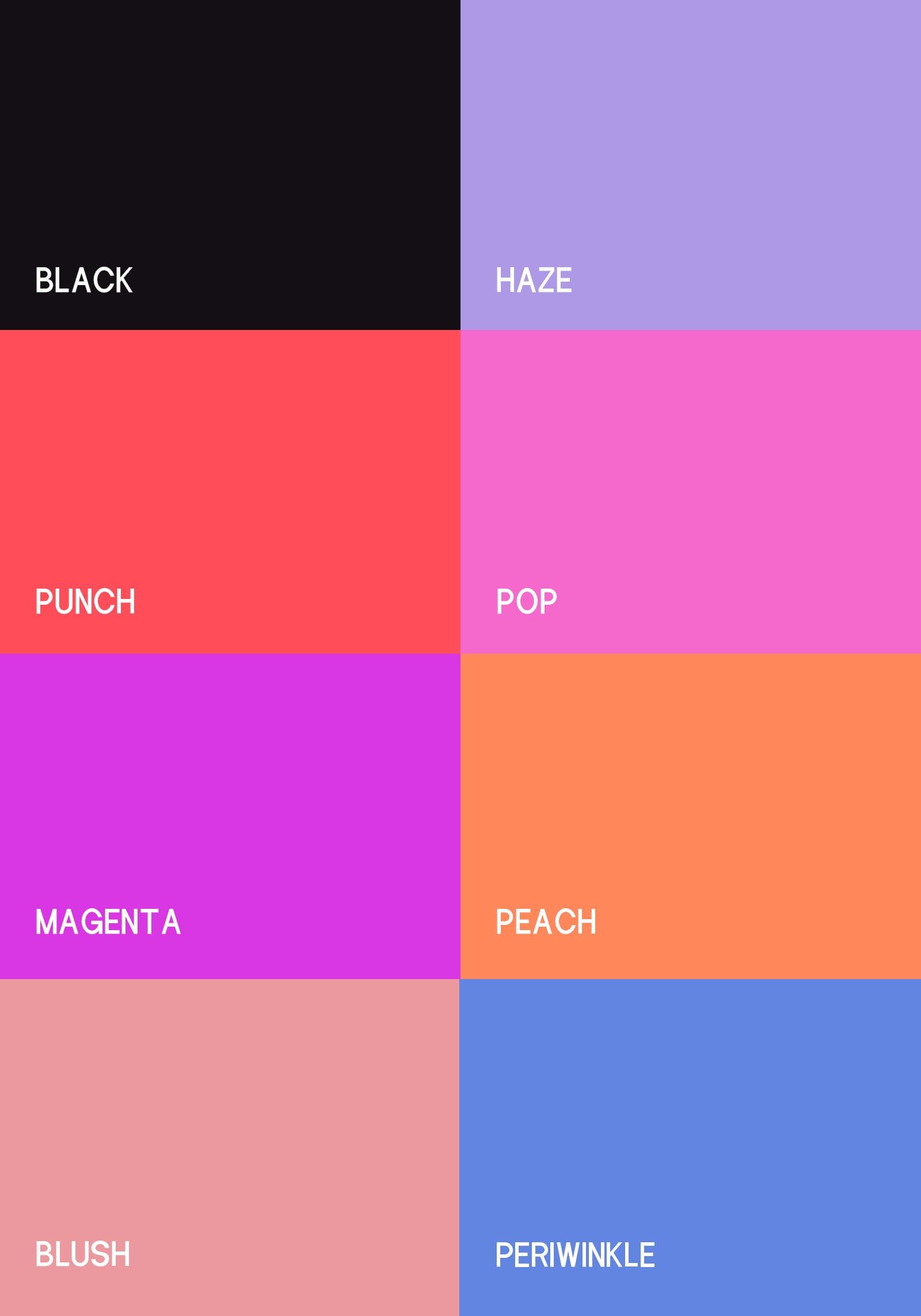
We designed a brand identity that matches their fearless approach. The fluid wordmark nods to life's inevitable twists and turns (with a hidden "coast" for those smoother moments), while the color palette balances calming blues with energizing brights because healing isn't always peaceful. Every element of the packaging system reflects their philosophy: embrace the ride, don't hide from it. In a category full of whispered euphemisms and pastel prettiness, Rollercoaster stands out by speaking the truth about women's experiences with both warmth and unflinching authenticity.
Working with Alfa Charlie took things to the next level. They brought Rollercoaster to life visually, capturing the energy, nuance, and unapologetic boldness of our brand. From the logo to the packaging, every detail reflects our mission to move with women through every phase. I always wanted a woman to design Rollercoaster's assets (for obvious reasons, duh) and couldn’t have asked for more thoughtful and intuitive creative partners. Trust them, as they're such a powerful team.