


Why Design Strategy Is Critical for Femtech Brands

In a world where women's health has historically been pushed to the shadows, relegated to hushed conversations and clinical sterility, design emerges as a powerful tool for change.
Breaking the Silence Through Visual Voice
For centuries, women's bodies and health concerns have been dismissed, stigmatized, or whispered about behind closed doors. The very existence of femtech challenges this status quo, bringing what was once hidden into the light. But to truly shift culture, these brands need design that doesn't just speak—it declares.
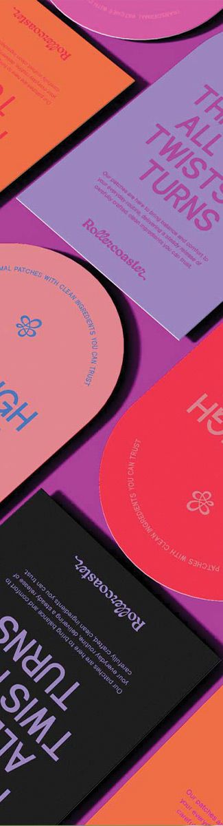
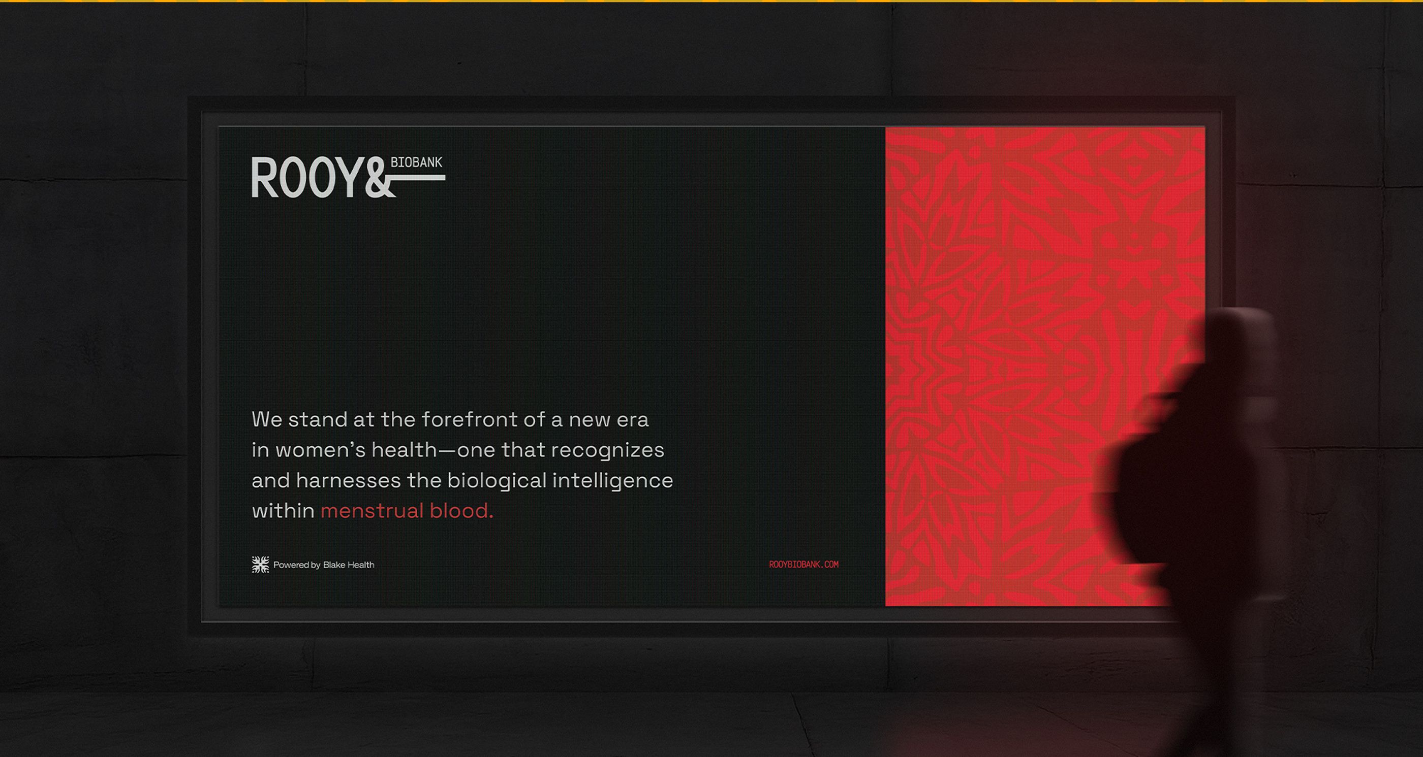
When a period tracking app uses bold colors instead of predictable pinks, when a menopause platform features diverse bodies rather than faceless silhouettes, when a fertility company chooses imagery that celebrates rather than medicalizes—these design choices are statements. They say: "We're here. We're not hiding. And neither should you."
This is why design for femtech isn't simply about looking good. It's about dismantling shame. It's visual activism.
In a market where silence has been the default, femtech brands must show up loud and proud. This doesn't mean every brand personality needs to be bold or brash, but it does require a certain fearlessness in visibility. Whether through confident color choices, direct messaging, or unapologetic imagery, these brands need to be seen, heard, and understood without compromise.
Designing Without Precedent
The unique challenge femtech brands face is that many are creating solutions for problems that haven't been publicly discussed before, let alone designed for. There's no established visual language for many women's health concerns.
How do you visualize vaginal wellness without being clinical or crass? What's the appropriate way to represent menopause that honors the experience without feeding into outdated narratives? What imagery speaks to those with endometriosis in a way that validates their pain rather than minimizing it?
Femtech designers are cartographers drawing maps where none existed. This demands not just creativity but courage—the willingness to forge new visual territory while remaining sensitive to the deeply personal nature of these experiences.
Building Trust Through Authenticity
For women navigating a healthcare system that has historically dismissed their pain, ignored their symptoms, and underrepresented them in medical research, trust doesn't come easily. Femtech brands must bridge this gap, and thoughtful design is crucial to establishing credibility.
Design choices signal to users whether a brand truly understands them. From the tone of voice in microcopy to the inclusivity of illustrations to the intuitive flow of user experience—each element answers a question users are subconsciously asking: "Do you see me? Do you get it?"
When a femtech brand's visual identity resonates with authenticity—showing they've done the research, listened to experiences, and designed with intention—it creates space for trust to grow.
Beyond the Binary: Designing for All Women
When we say "women's health," we mean all women—cisgender, transgender, and non-binary individuals. Inclusive design isn't a checkbox; it's a fundamental commitment to honoring diverse experiences, bodies, and identities.
This means rethinking everything from color palettes (moving beyond stereotypical "feminine" hues) to photography (representing diverse ages, races, body types, and gender expressions) to language (creating copy that doesn't assume all users have the same anatomy or experiences).
The most powerful femtech design recognizes that womanhood isn't monolithic. It creates visual systems flexible enough to speak to shared experiences while honoring individual journeys.
Making the Invisible Visible
Perhaps the most revolutionary aspect of femtech design is its role in making visible what society has deemed invisible. From menstrual cycles to menopause, from pelvic health to postpartum recovery—these experiences have been hidden away despite being fundamental to half the world's population.
Effective design brings these realities into the light. It uses visual storytelling to normalize conversations, demystify processes, and celebrate bodies in all their complexity. Through thoughtful information design, complex health concepts become accessible. Through careful use of imagery, stigmatized experiences become seen.
From Clinical to Personal: The Design Shift
Traditional healthcare design has typically reflected a clinical, detached approach—sterile blues, abstract icons, and impersonal terminology. Femtech design represents a paradigm shift: it acknowledges that health is deeply personal.
The most successful femtech brands use design to humanize the experience, creating digital spaces that feel less like a doctor's office and more like a trusted friend. This doesn't mean sacrificing expertise or credibility. Rather, it means presenting information through a lens of empathy and understanding.
Conclusion: Design as the Catalyst for Change
For femtech brands, thoughtful design isn't a luxury—it's essential. It's the vehicle through which cultural stigmas are challenged, taboos are dismantled, and new narratives are written.
At Alfa Charlie, we recognize that designing for femtech means more than creating beautiful interfaces or memorable logos. It means using visual communication as a tool for cultural transformation. It means designing spaces where women can find information, community, and solutions without shame or judgment.
As we continue to partner with brands that are reshaping women's health, we remain committed to design that doesn't just look good—it means something. Because in femtech, design isn't just about aesthetics. It's about justice. It's about time. And it's about showing up unapologetically for the health of all women.
Ready to elevate your femtech brand with purpose-driven design? Let's connect and create work that shifts the culture.