


From Taboo to Transformative: The Story Behind Blake Health’s Bold Brand Identity
A look at our 2025 WomanKind grant winner and the design process behind an innovative women’s health brand redefining menstrual blood
The Challenge: Making Menstrual Blood Beautiful
For centuries, menstrual blood has been treated as medical waste. Hidden, dismissed, and written off as something unworthy of attention. But that stigma has kept people from seeing what’s actually there: complexity, intelligence, and surprising beauty. What we’re taught to see as “gross” is, in reality, a rich biological record with depth and possibility.
Enter Karli Büchling (aka The Period Dealer), the powerhouse behind Blake Health and ROOY& Biobank, Europe’s first menstrual blood biobank. Her mission is to unlock new insights into women’s health by studying the biological intelligence inside menstrual blood. Her challenge was more than scientific. It was cultural. How do you create a brand that shows the beauty and power in something everyone has learned to overlook?
Unearthing the Brand Story Behind the Science
When Karli walked into our brand strategy sessions, she brought fascinating research, compelling statistics, and a deep passion for closing the gender gap in women's health. As she explained the science and social context of menstrual blood, we realized how much had been overlooked and were captivated by potential.
Through our discovery process, Blake Health’s mission became clear. They stand at the front of a new era in women’s health. One rooted in biological intelligence, ethical data practices, and meaningful collaboration. They aren’t just challenging old systems. They’re building a new one.
A Bold, Human Brand Personality
We positioned Blake Health as a brand that balances scientific rigor with human warmth. The kind of brand that makes complex science feel accessible. Think Taylor Swift at the 2025 Grammys: confident, engaging, and creating an exclusive club that everyone wants to join. Our tone became unapologetically honest because when it comes to health, people deserve the truth delivered with warmth, clarity, and just a touch of cheekiness.
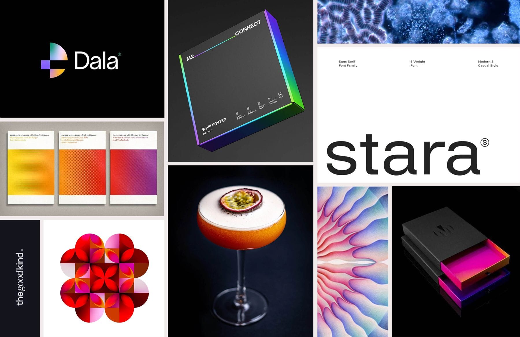
Visually, the direction became clean, bright, and expressive. Primarily black and white with a splash of rainbow that Karli had already begun exploring. It serves as a simple idea: menstrual blood contains more dimension than people expect. More color, more information, more potential.
Blake Health isn't just a creative brand. It should spark creativity in others. Partners, researchers, and women themselves should feel invited to think differently. To see menstrual blood as multilayered rather than one-dimensional. We recommended exploring an artistic pattern system inspired by menstrual blood itself to highlight its depth and beauty.
Transforming Menstrual Blood into Visual Storytelling
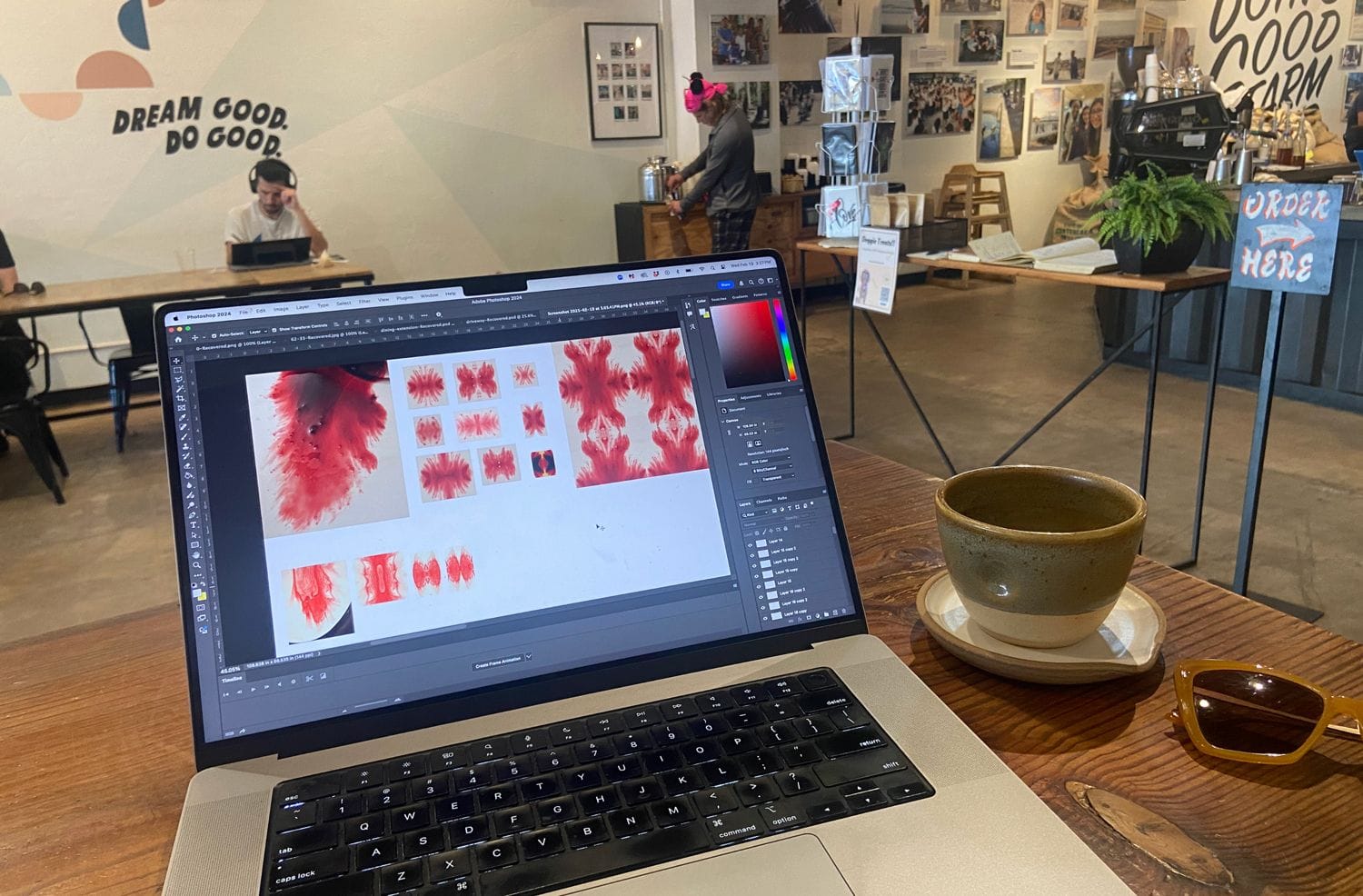
Our visual explorations began with Karli’s personal research archive. She had years of photos and videos from her own menstrual blood experiments and studies, many conducted in her bathroom. Once she shared them, we started selecting pieces that inspired us and revealed unique characteristics.
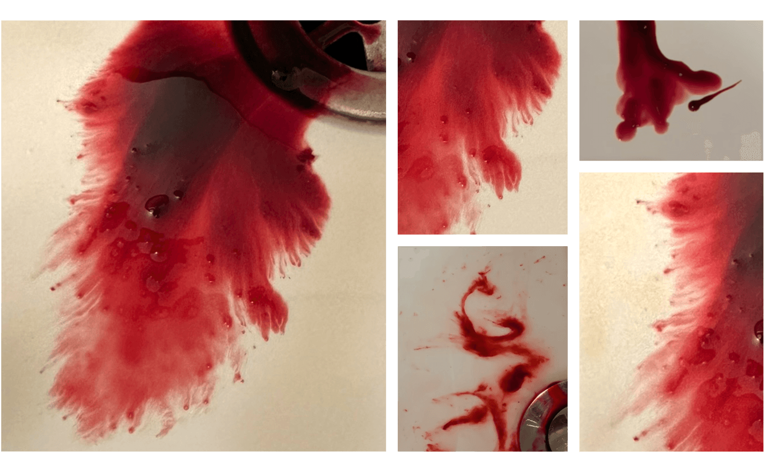
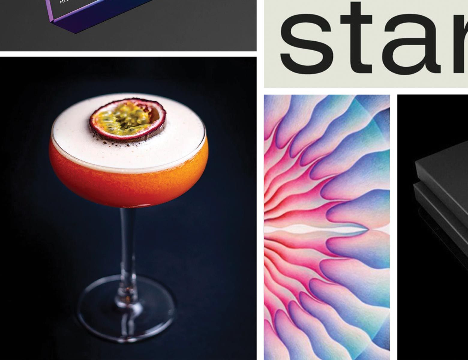
We were immediately drawn to some of the intricate details around the edges of the menstrual blood. It moves in a really interesting and unique way, and when we looked closely, the edges revealed beautiful shapes and fascinating details that most people never get to see.
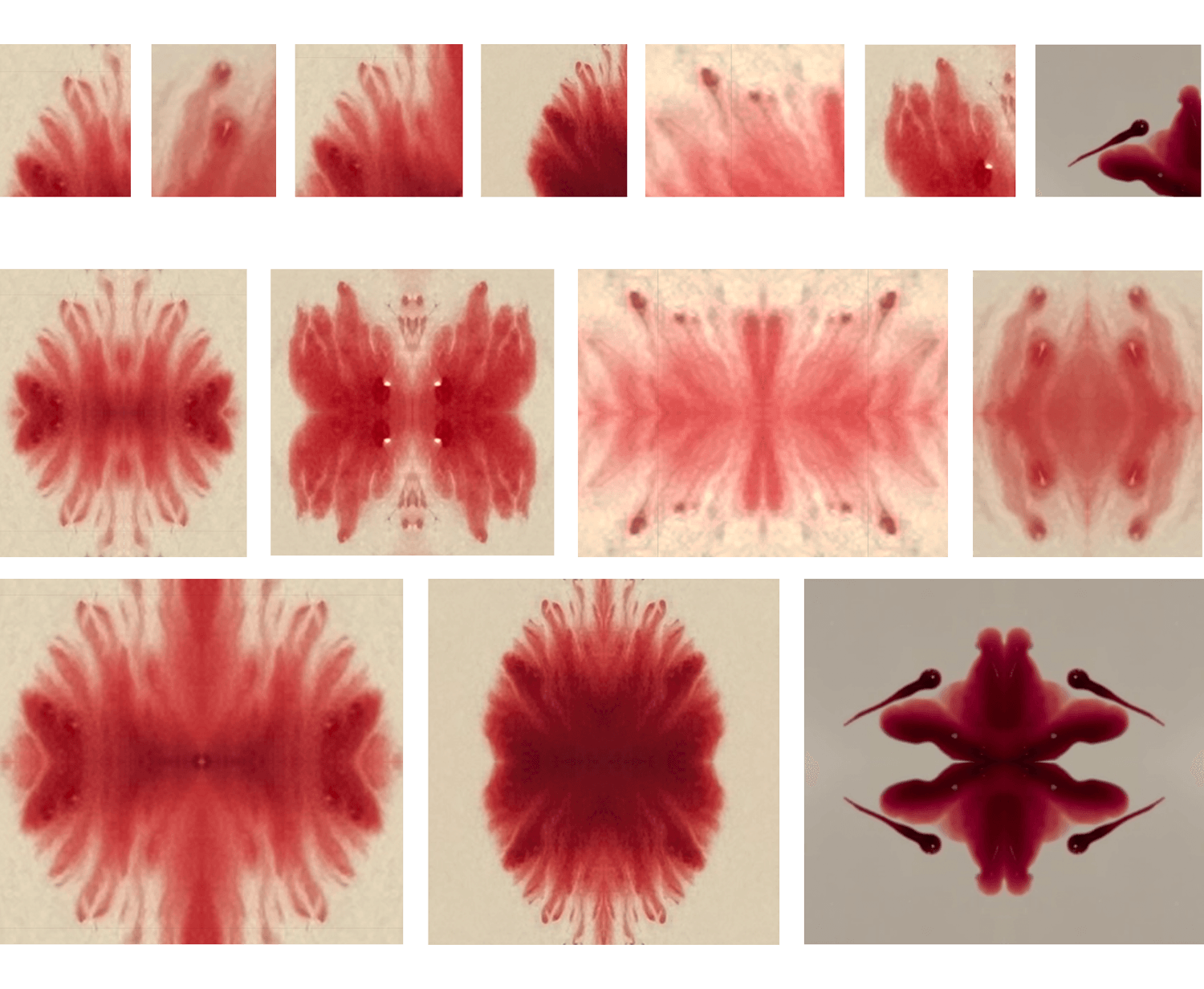
The Art of Symmetry
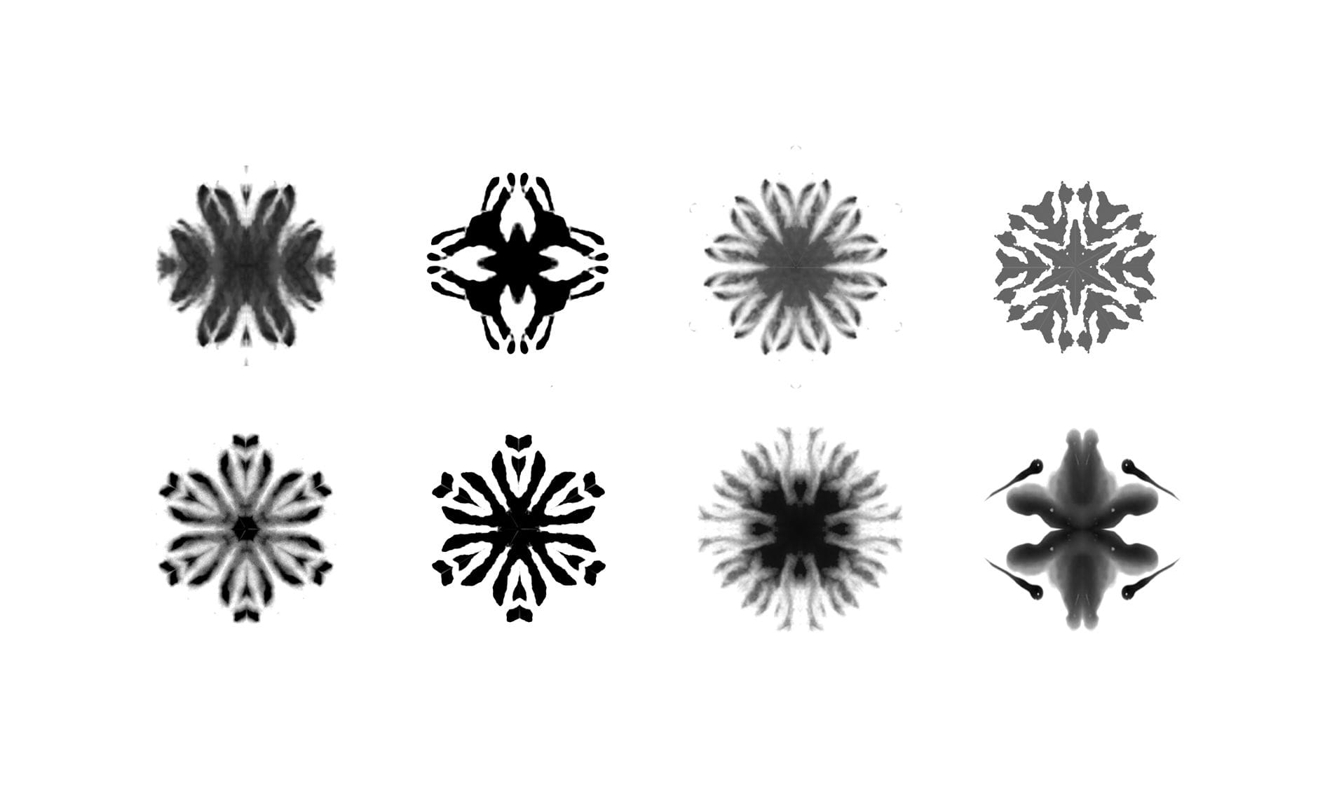
We leaned into symmetry as a fundamental, universally recognized marker of beauty. Research shows that humans subconsciously perceive symmetry as aesthetically pleasing, and we wanted to harness that principle. By reflecting these details both vertically and horizontally, we created symmetrical, Rorschach-style images. The effect was immediate: patterns that felt intentional, engaging, and visually striking. The mirrored forms invited curiosity and interpretation, transforming menstrual blood into something undeniably beautiful.

Mirroring revealed layers within the blood that had previously gone unnoticed. It softened stigma, highlighted complexity, and transformed menstrual blood into something resembling modern art. The process was addictive. By the end of the day, we had explored countless reflections, and the results were energizing. We could see how this approach might spark the same curiosity and creativity in others.
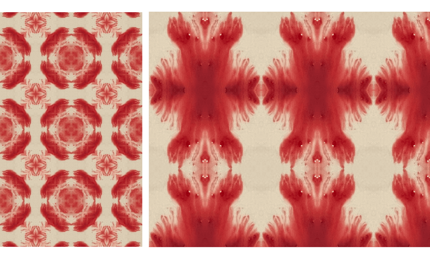
From there, the concept evolved into a repeatable pattern with infinite possibilities. As we reflected and repeated the visuals outward, they transformed into a bigger picture. At first glance, the patterns feel decorative, almost wallpaper-like, but they invite you to look closer. The more you look, the more the depth becomes apparent. What you believe to be abstract beauty reveals itself as menstrual blood.
As much as we celebrated this beauty, we also confronted the deeply ingrained stigma surrounding menstrual blood. Sitting at a coffee shop, scrolling through images and experimenting with reflections, we were forced to face our own biases and normalize the conversation on a personal level. We felt uncomfortable–but that discomfort was exactly the point. It became an unexpected but necessary exercise in breaking down internalized stigma.
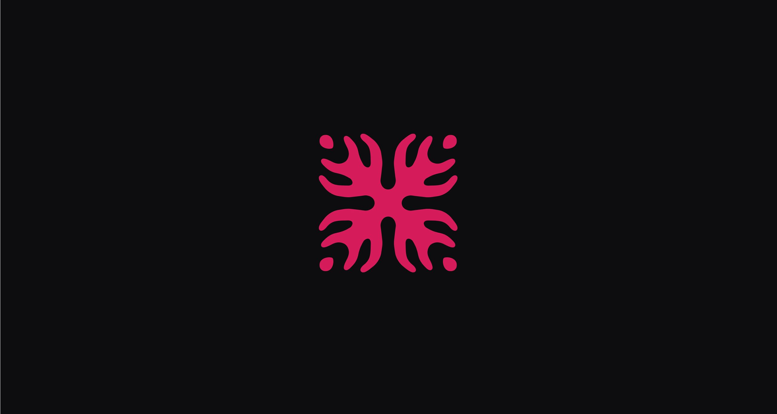
With the visual direction set, we turned to the challenge of translating it into a usable visual identity. Our first focus was the logo itself. Our task was simple yet challenging: how do we simplify this concept to its most minimal state while still retaining the integrity and character of menstrual blood? We experimented with how far we could push it.
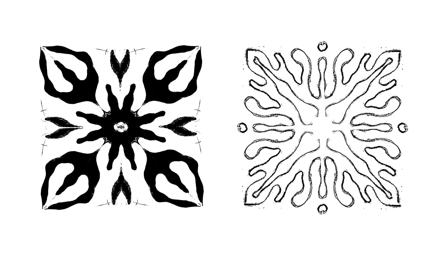
We began sketching. With a clear understanding of the curves, movement, and characteristics of menstrual blood, we explored countless symmetrical marks, adding our own creative, human touch to each iteration.
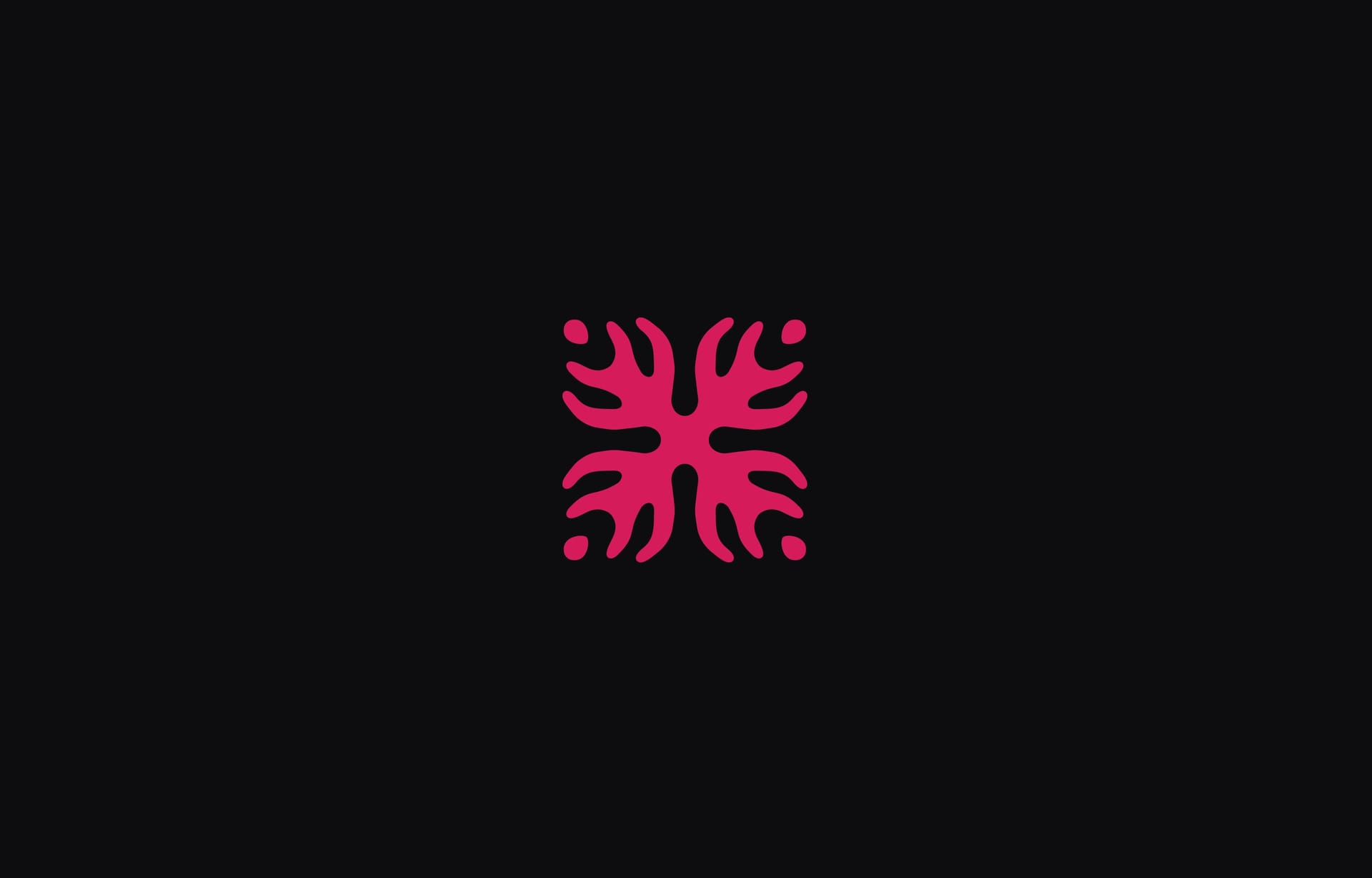
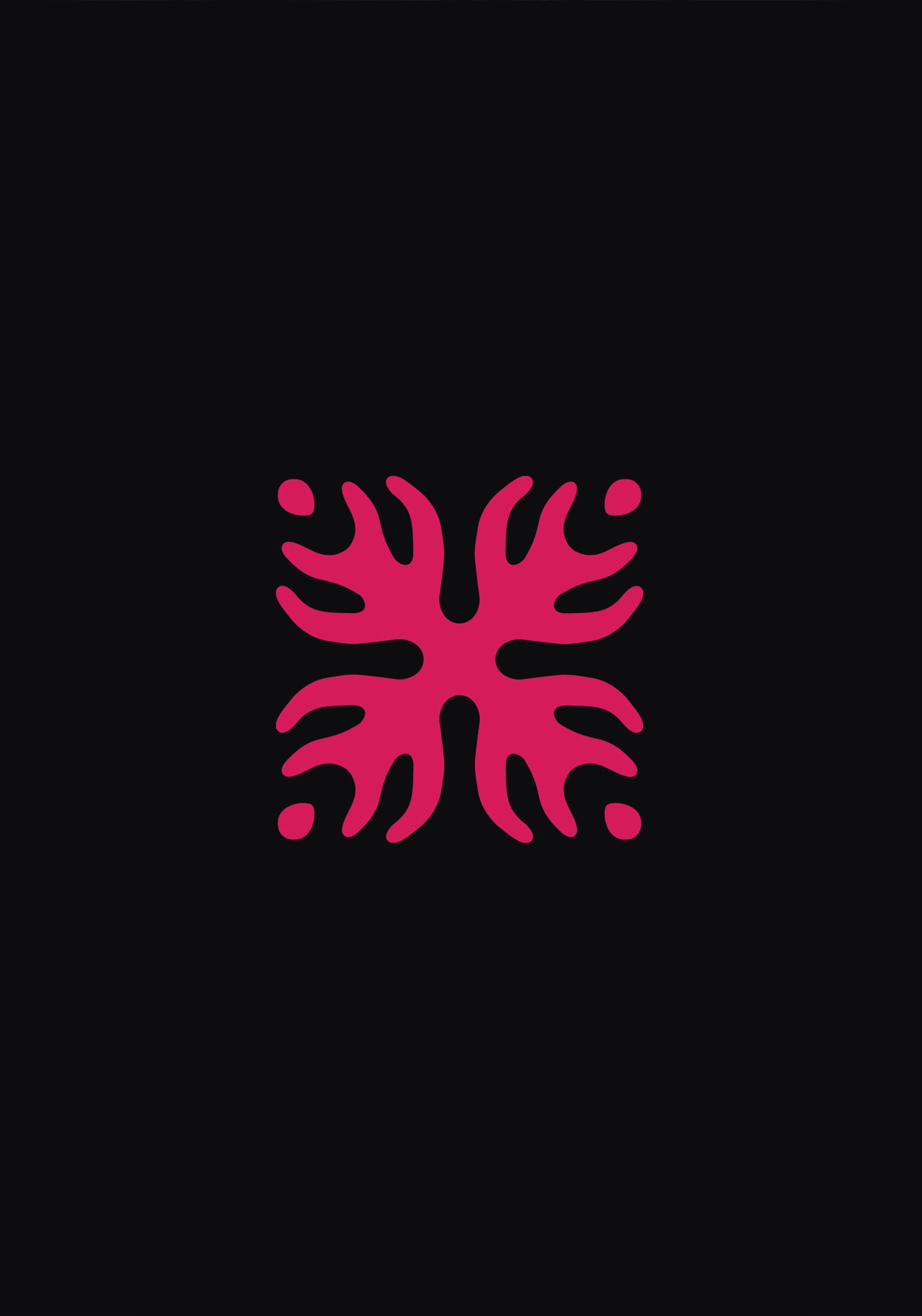
Ultimately, we arrived at a balanced, symmetrical icon that reflects Blake Health’s mission. Inspired by the organic beauty of menstrual blood, the logo takes a mirrored, Rorschach-like form—inviting curiosity, creativity, and a shift in perspective. The four dots in each corner symbolize the core principles of the brand: discovery, collaboration, equity, and transformation.
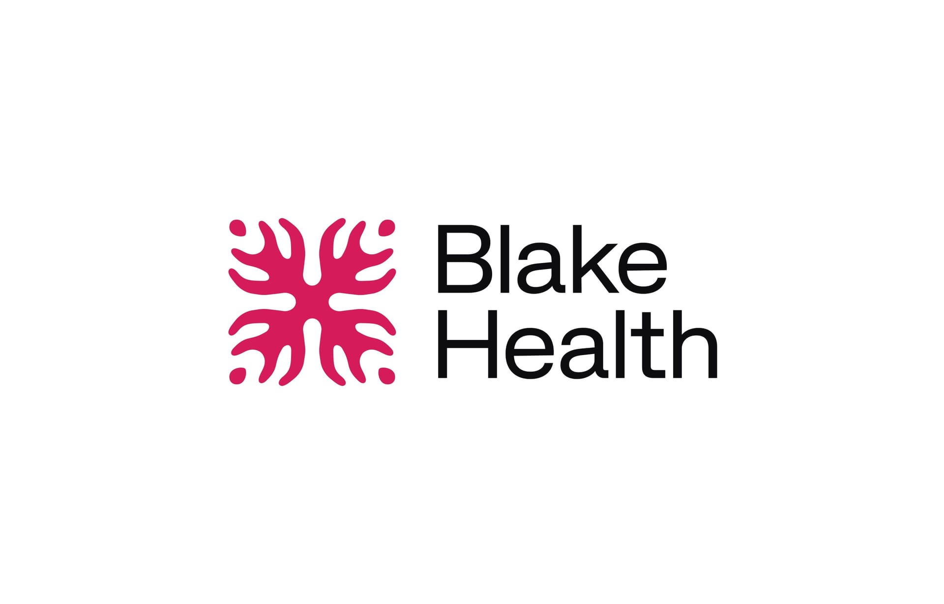
The icon was paired with a clean, modern sans-serif font, rooted in the Helvetica tradition but with a bold and slightly scientific edge. The type balances clarity with modernity, reflecting Blake Health’s dual nature—scientific yet creative, precise yet open-ended. Together, the icon and font articulate a future where healthcare is rigorous, revolutionary, and inspiring.

The color palette is rooted in black and white, but layered with a rainbow of potential—15 unconventional hues that represent diversity, discovery, and the endless possibilities in menstrual blood research. The primary color, Crimson, reflects the richness and complexity of the material itself. Typography balances precision with approachability: Space Grotesk gives headers a modern, technical edge, while IBM Plex Sans and IBM Plex Mono ensure clarity and accessibility. Together, the colors and fonts reinforce Blake Health’s mission of bridging human biology with cutting-edge research and technology.
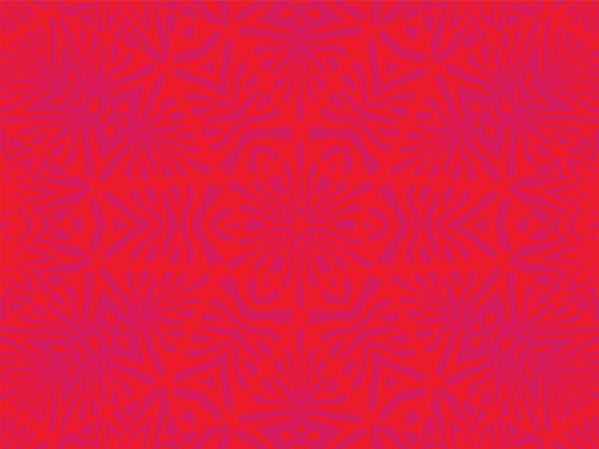
Kaleidoscope of Discovery
The brand patterns expand on the logo’s mirrored symmetry, transforming menstrual blood imagery into striking, abstract designs. Like a kaleidoscope, these patterns reveal layers and complexity that might be overlooked at first glance. They represent transformation, infinite possibilities, and the ever-evolving nature of scientific discovery. Dynamic and flexible, the patterns can shift and evolve, uncovering new perspectives much like the breakthroughs that will emerge from Blake Health’s research. Used thoughtfully, they create moments of impact, reinforcing the beauty, intelligence, and power of something that has long been misunderstood.
To see this kaleidoscope animations come to life, visit our Blake Health portfolio feature.