CHALLENGE
Aisle Planner is an all-in-one marketing, client management, and planning platform for event professionals. To support the marketing needs of their event pros, The Aisle Guide launched as a destination for couples seeking inspiration, tools, and tips while seamlessly connecting them to industry professionals. So, how do industry leaders continue to elevate the Aisle Planner experience? They return to the old.
Aisle Planner approached us to brand their latest endeavor, The Aisle magazine. Our challenge: rebrand a leading online publication for print so that it feels related but different enough to have a personality of its own.
APPROACH
Utilizing the modern aesthetic of Aisle Planner and The Aisle Guide, we focused on an art-forward and sophisticated approach to the look and feel of The Aisle, an elevated, modern, and bespoke wedding magazine curated by The Aisle Guide.
BRANDING
The Aisle Magazine logo is created using a wide sans serif font, Orelo, designed by Adrien Midzic. It features high-contrast strokes that give it a modern and sophisticated feel and has been described as a “sans-serif tribute to Didot.” The wide format allows the logo to be enlarged, while its hairline stokes keep it elegant without feeling heavy.
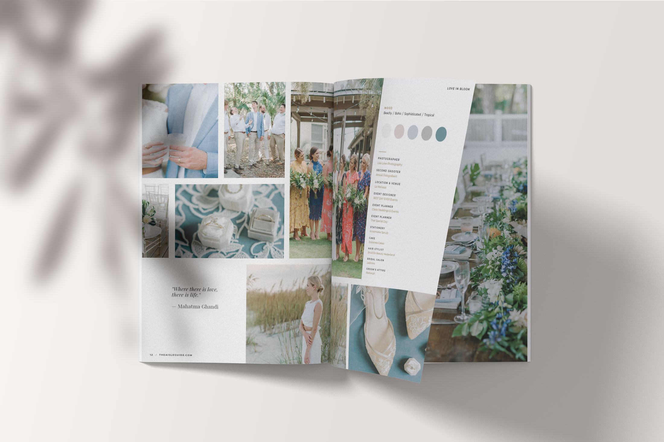
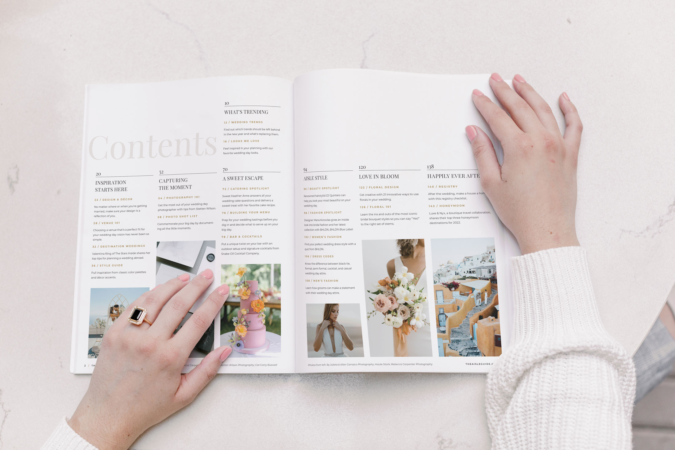
The rest of the visuals came together in the interior spreads. Using The Aisle Guide as a reference, we stay on brand with the use of Monsterrat as a body text and Playfair for headers. The color remains within the Aisle Planner palette, with a strong focus on black, white, gold, and shades of blush.
Images play hommage in the online publication, with masonry grids and the use of white borders. Overall, The Aisle’s chic and elegant.


COVER DESIGN
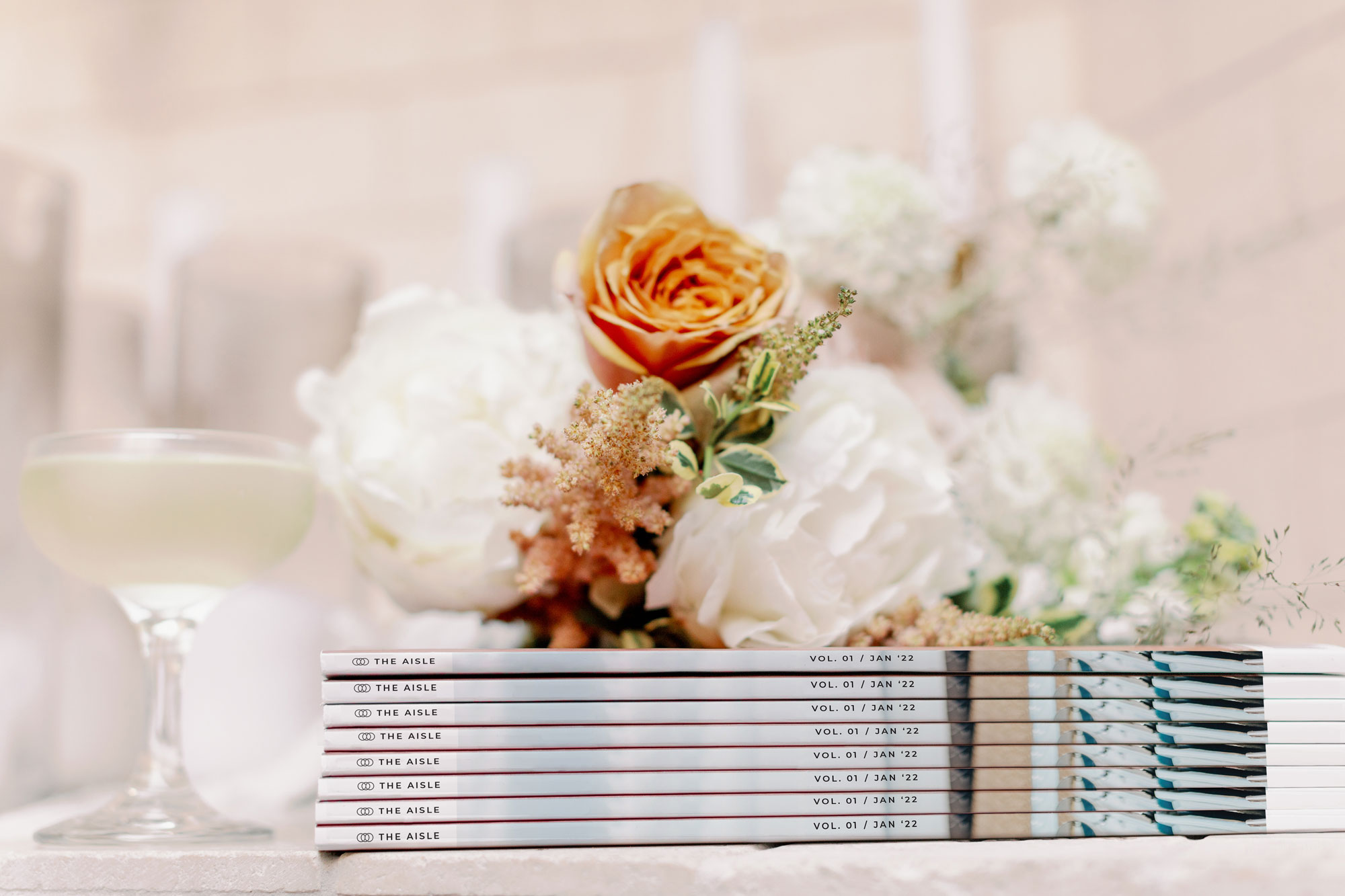
The masthead logo runs over the image’s top edge, creating clean negative space and visual hierarchy with the photo. A white bar along the bottom houses the cover titles without interference from the image. This ensures a clean design with every issue. The top and white bottom bars bleed around the spine to create a branded visual appearance when multiple volumes are stacked, adding a unique branded touch.


STRUCTURE
Outside of full-page ads, all remaining magazine pages use a 12-column grid system, allowing for exploration and flexibility of composition. The publication has a trim size of 9.5” x 12” to maximize cinematic imagery.

Photos courtesy of Camila Margotta
