


Why Minimal Design Works for Femtech Brands


In recent years we've seen a return to the 'less is more' mentality and a reconnection to minimalism—particularly in women's health branding. Perhaps, this longing for simplicity demonstrates the necessity of removing ourselves from the complex, high-tech world we are in, and finding ways to immerse ourselves in what is essential. For femtech startups and women's health companies, minimal design can create the trust and clarity needed to communicate sensitive health topics.
Origin of Minimal Design
The phrase "less is more" is often associated with German-American architect and designer, Ludwig Mies Van Der Rohe. Known for his design of the skyscraper, Mies believed that elegance was not derived from abundance. While Mies' buildings were unornamented, they were not plain. He achieved visual richness by placing emphasis on pure essentiality and functional perfection casting aside any elements that do not contribute to the beauty or function of an object or space.
The ability to simplify means to eliminate the unnecessary so that the necessary may speak. – Hans Hoffman
In American visual art, the movement of 'less is more' is still relatively new, having only come into its own in the late 1960s and early 1970s, known as minimalism. It borrows heavily from European and Japanese influence, and can be seen across various industries, from web design and branding to interior spaces and furniture design.
Simplicity denotes clarity of concept and ideas. When we strip something down to the core of its foundation we can then bring forth the most important elements that need to be communicated—a principle essential to effective femtech brand strategy.
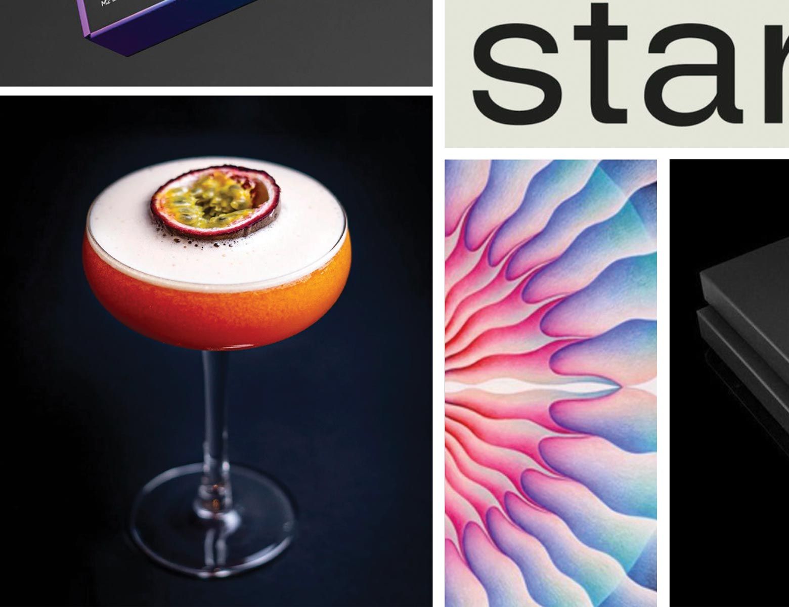
When Minimal Design Works for Femtech Brands
At Alfa Charlie, a creative agency specializing in femtech branding, we've seen minimal design work particularly well for women's health startups that need to communicate complex medical information clearly. Minimal design excels when brands need to build trust quickly, explain complicated health concepts, or create calm, reassuring experiences for users navigating sensitive topics.
For femtech companies dealing with reproductive health, fertility, or intimate wellness, minimal design can strip away distractions and focus attention on what truly matters—helping women understand and improve their health. The clean aesthetic often associated with medical environments translates well to digital health platforms where users need to feel confident and secure.
The Minimal Design Trap: When Less Becomes Meaningless
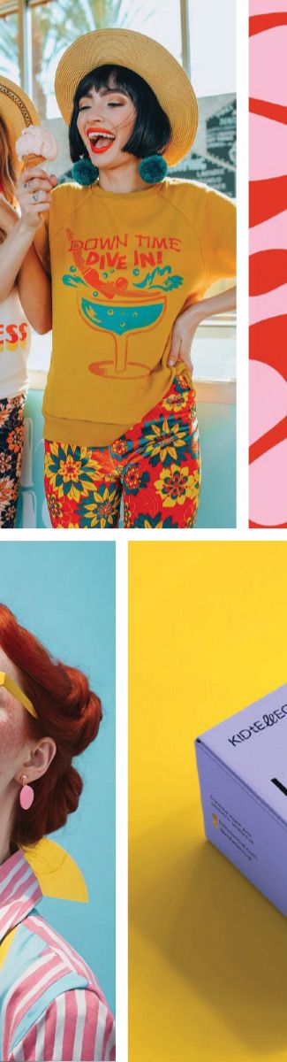
Minimal design isn't appropriate for every brand. We've seen many companies fall into the trap of reducing so much that they lose all personality and meaning. When brands mistake "minimal" for "generic," they end up looking like every other startup with the same sans-serif font, bland color palette, and empty white space.
The biggest mistake we see in femtech branding is when companies strip away so much character that they become indistinguishable from their competitors. This is particularly problematic in women's health, where building emotional connection and trust is crucial. A fertility app that looks identical to a period tracker that looks identical to a mental health platform serves no one well.
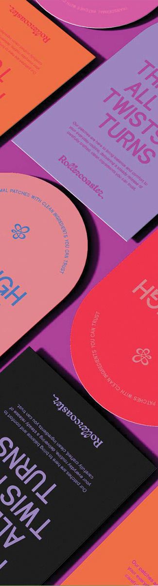
Good Minimal Design: Reducing to What's Essential
True minimal design isn't about removing everything—it's about reducing down to what is necessary and essential for your brand's unique story. Sometimes what's essential includes personality, warmth, or even a touch of whimsy. A sexual wellness brand might need bold, confident colors as part of their essential message. A maternal health app might require gentle, nurturing elements that convey care and support.
At Alfa Charlie, when we approach minimal design for women's health brands, we ask: What does this brand absolutely need to communicate its core message? Sometimes that means including distinctive typography that reflects the brand's personality. Sometimes it means using a carefully chosen color that evokes the right emotion. The key is intentionality: every element should serve the user experience and brand story, even if that means the design isn't stark or empty.