
The Uncharted Visual Identity: How Creative Development Transforms Women's Health Startups
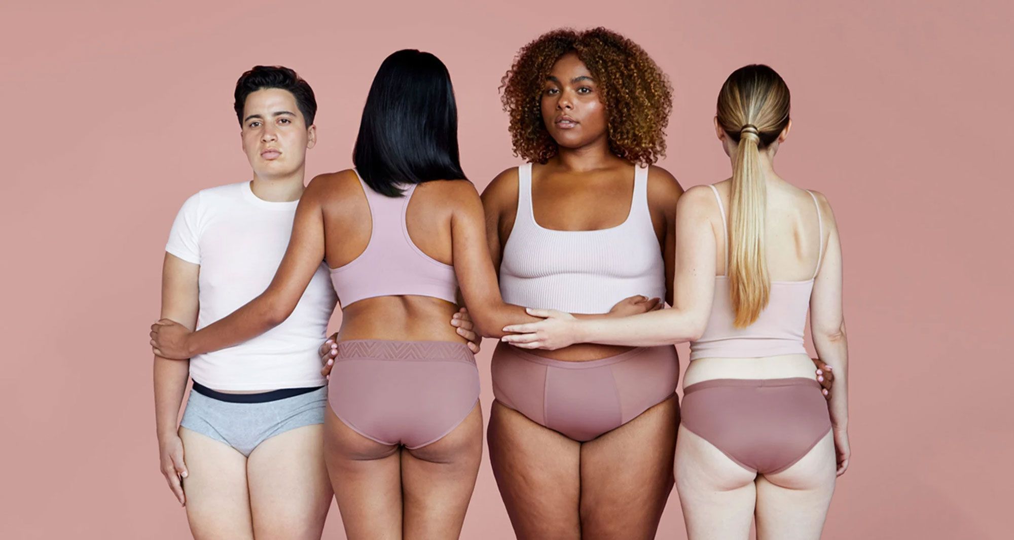
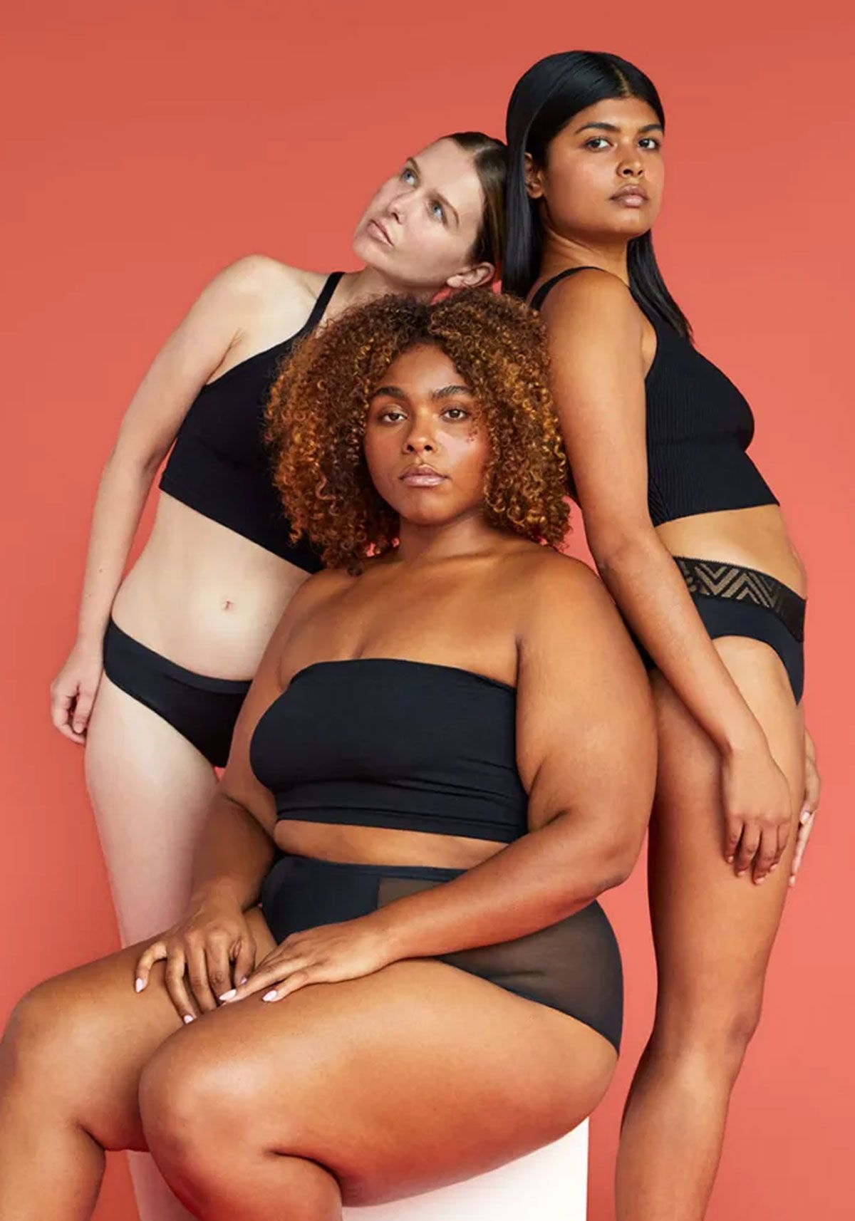
Photo credit: Thinx
For decades, women's health has been shrouded in shame, whispered about behind closed doors, and relegated to the margins of mainstream healthcare. But today's women's health startups are changing that narrative—and it starts with how they show up visually. As a creative development agency specializing in women's health tech, we've witnessed firsthand how the right visual identity can transform not just a brand, but an entire industry's approach to women's wellbeing.
Breaking Free from the Pink Prison
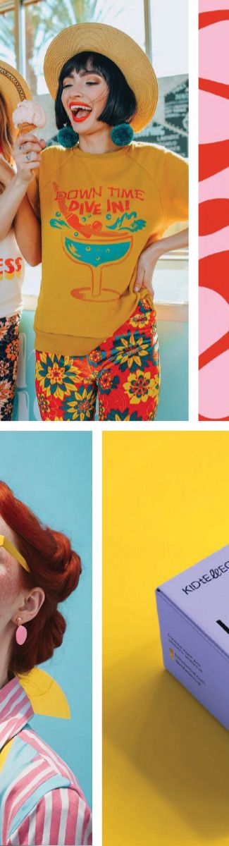
Walk down any pharmacy aisle and you'll see the problem: women's health products drowning in a sea of soft pinks, delicate flowers, and whispered promises. This visual language has kept women's health small, apologetic, and "other." But revolutionary women's health startups are breaking free from these tired tropes.
Take Thinx, the period underwear brand that dared to use bold, unapologetic colors and subway ads that actually said the word "period." Or Elvie, whose sleek, minimalist design made breast pumps look more like premium tech gadgets than medical devices. These women's health tech companies understood something crucial: visual identity isn't just about looking good—it's about challenging culture.
The Power of Strategic Visual Positioning
As a creative development agency, we've learned that transforming women's health startups requires more than just good design. It demands strategic visual positioning that:
Makes the Invisible Visible
Women's health has been hidden for too long. Bold visual identities bring these conversations into the light. When Clue chose deep purples and sophisticated data visualizations for their period tracking app, they weren't just designing an interface—they were making menstrual health feel intelligent and empowering.
Challenges Medical Sterility
Traditional medical branding feels cold and clinical. Women's health startups are embracing warmth, humanity, and accessibility. Maven's approachable illustrations and calming color palette transform virtual healthcare from intimidating to inviting.
Speaks to Real Women
Cookie-cutter feminine branding doesn't reflect the diversity of women's experiences. Forward-thinking women's health brands are embracing inclusive imagery, diverse representation, and visual languages that speak to all women—not just the narrow demographic that healthcare has traditionally served.
From Shame to Strength: The Visual Transformation
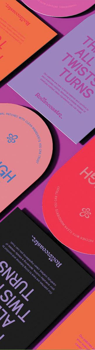
The most powerful women's health startups understand that their visual identity is their first act of rebellion. When Lola launched with clean, confident packaging that proudly displayed tampon ingredients, they weren't just selling period products—they were demanding transparency in an industry built on secrecy.
These are visual identities that refuse to apologize, hide, or whisper. Instead, they:
- Claim space with bold typography and confident color choices
- Speak truth through clear, direct messaging
- Celebrate bodies with inclusive, empowering imagery
- Demand attention instead of asking permission
The Creative Development Process That Changes Everything
Working with women's health startups requires a different approach than traditional creative development. We don't just ask "What do you want to look like?" We ask "What change do you want to create?" Because for women's health tech companies, visual identity is activism.
Our process begins with understanding the cultural barriers your startup is breaking through. Are you normalizing menopause? Destigmatizing fertility struggles? Making maternal mental health visible? Your visual identity becomes the vehicle for that change.
Then we craft visual systems that feel revolutionary, not reactive. Colors that command attention rather than blend in. Typography that speaks with authority, not apology. Imagery that celebrates rather than conceals.
The Ripple Effect of Bold Visual Choices
When women's health startups choose bold visual identities, they don't just transform their own brands—they shift the entire industry. Cora's bright, joyful branding showed that period care could be optimistic. Nurx's tech-forward aesthetic proved that reproductive health could be convenient and modern.
Each brave visual choice creates permission for the next women's health startup to be even bolder. This is how industries evolve—one confident brand at a time.
Designing for the Future of Women's Health
The women's health tech revolution is just beginning. As more startups enter this space, the ones that will truly transform culture are those that understand the power of visual identity to challenge, inspire, and liberate.
At Alfa Charlie, we're not just a creative development agency—we're partners in revolution. We help women's health startups craft visual identities that don't just look different, but change how the world sees women's health entirely.
Because when women's health shows up boldly, unapologetically, and beautifully, culture shifts. And that shift starts with design.
Ready to transform your women's health startup with a visual identity that creates change? Let's chart new waters together.